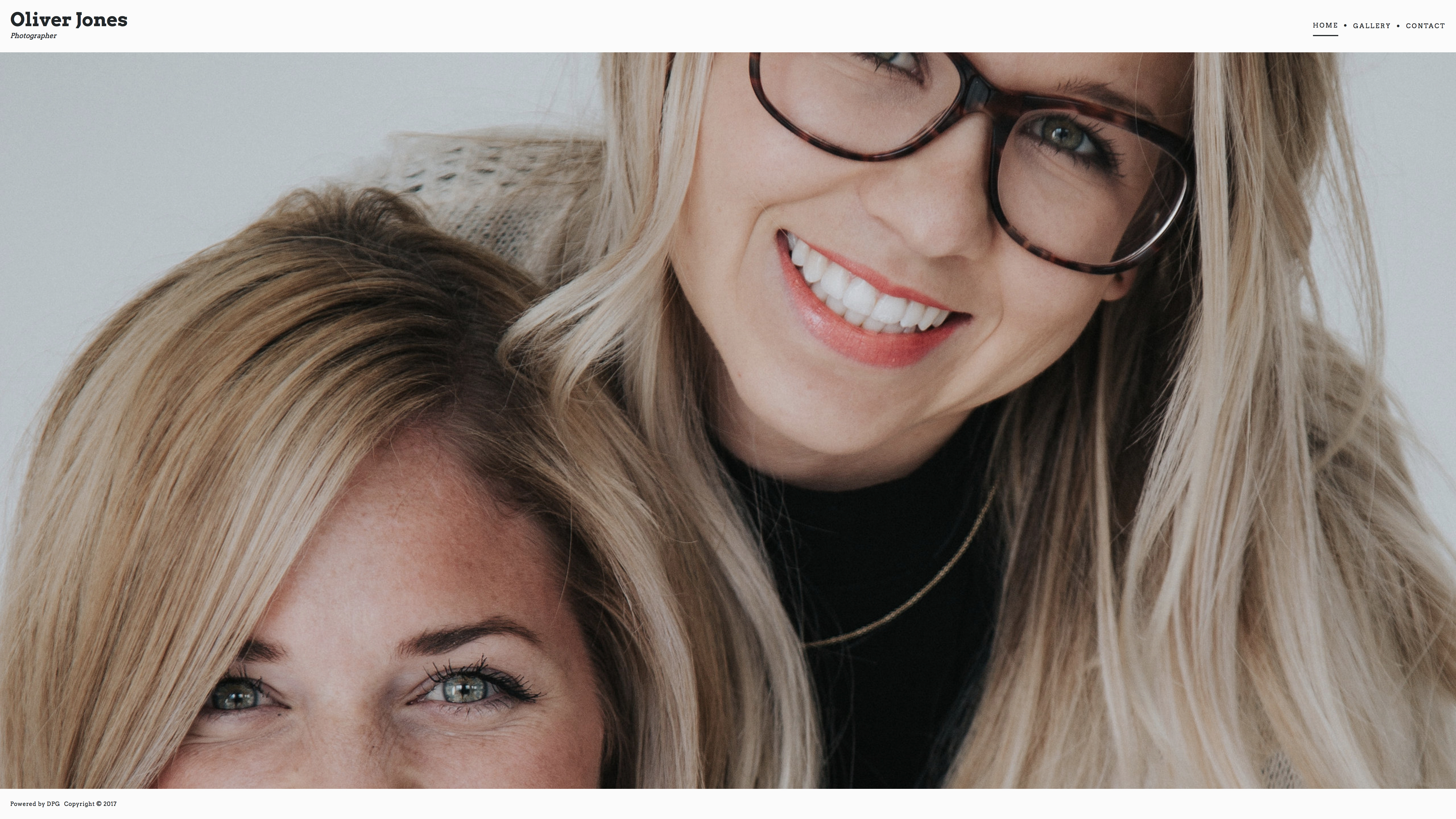
❌ Avoid using images where the focal point is towards the edges, as they may be cropped on wide monitors.
Flexible Side Scroll - Fullscreen Slideshow image selection tips
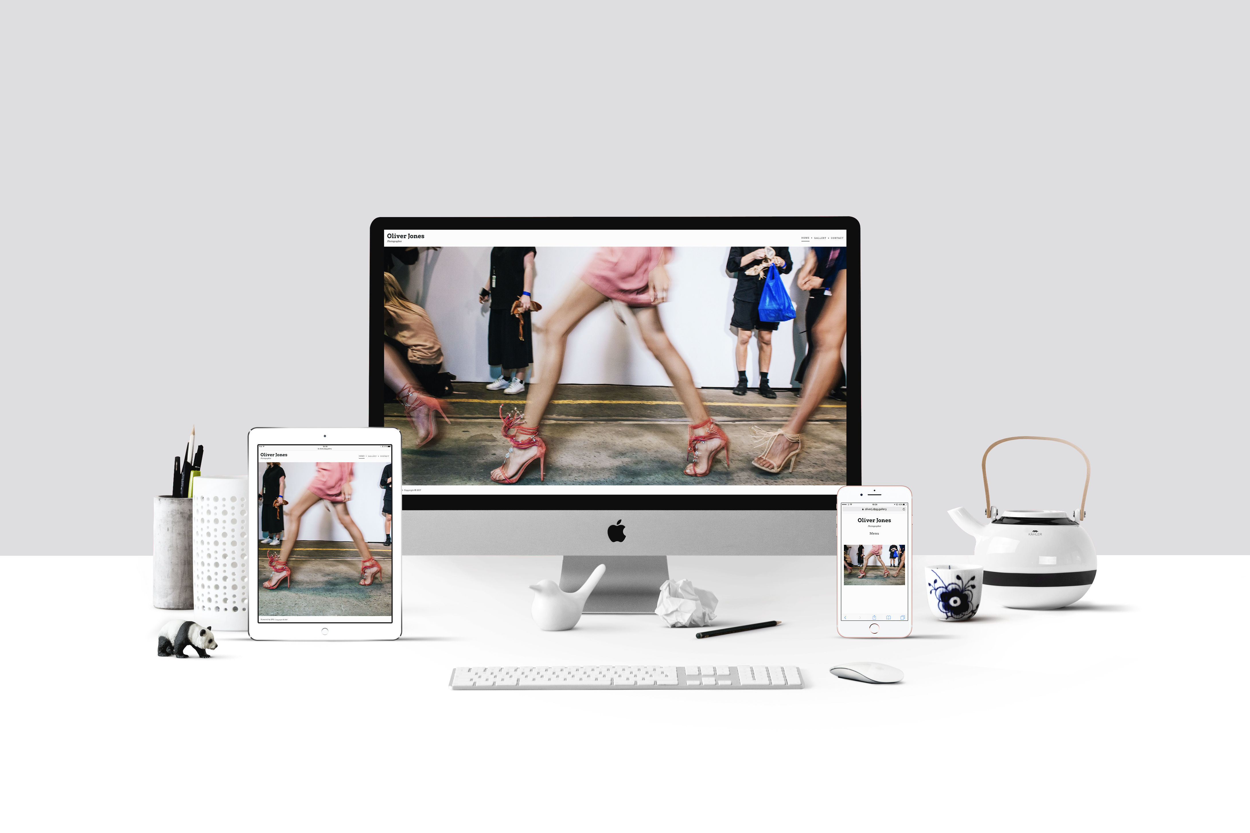
If you're using the Image Slideshow page on your Flexible Side Scroll site, you may have noticed that images added to this page will look different depending on your device or monitor aspect ratio.
Your site will be accessed on all kinds of devices - from large desktops, to tablets and phones in both portrait and landscape orientation, which is why DPG works best with full resolution images in their standard aspect ratio - we'll serve the version of the image that's best suited for each device.
For the fullscreen slideshow page, the image may be cropped at the top and bottom or sides to fill the entire screen of your visitor, so here are some things to consider when choosing images for your homepage:
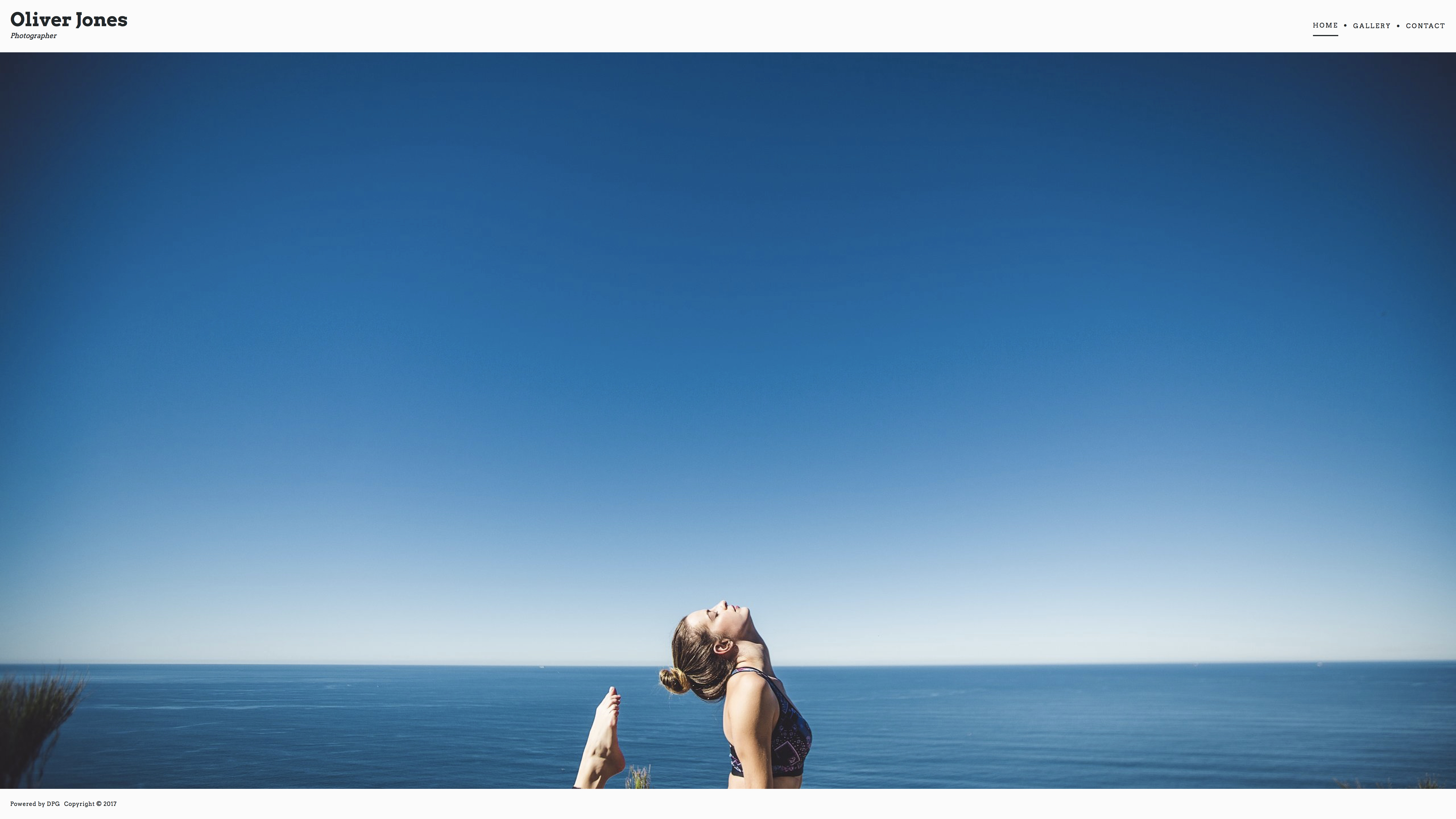
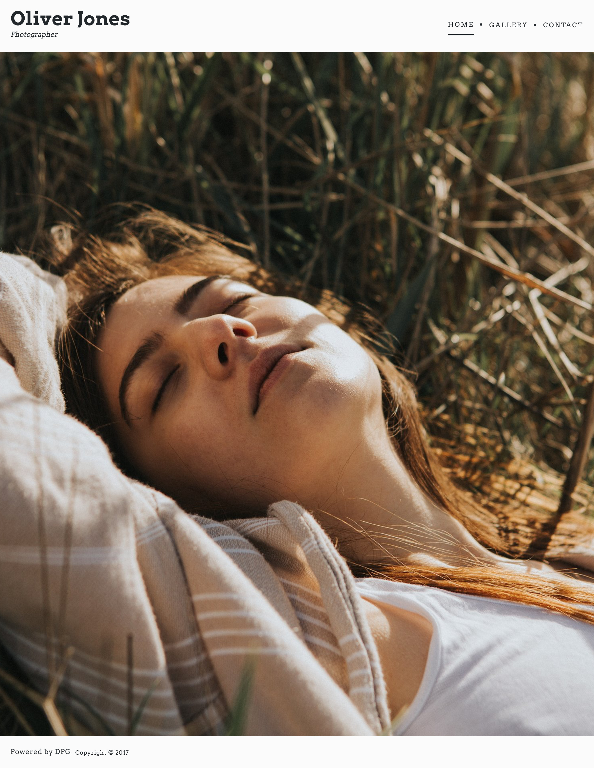
❌ The same page as viewed on an iPad Pro - looks great in portrait orientation, but it's not the ideal choice for all devices.
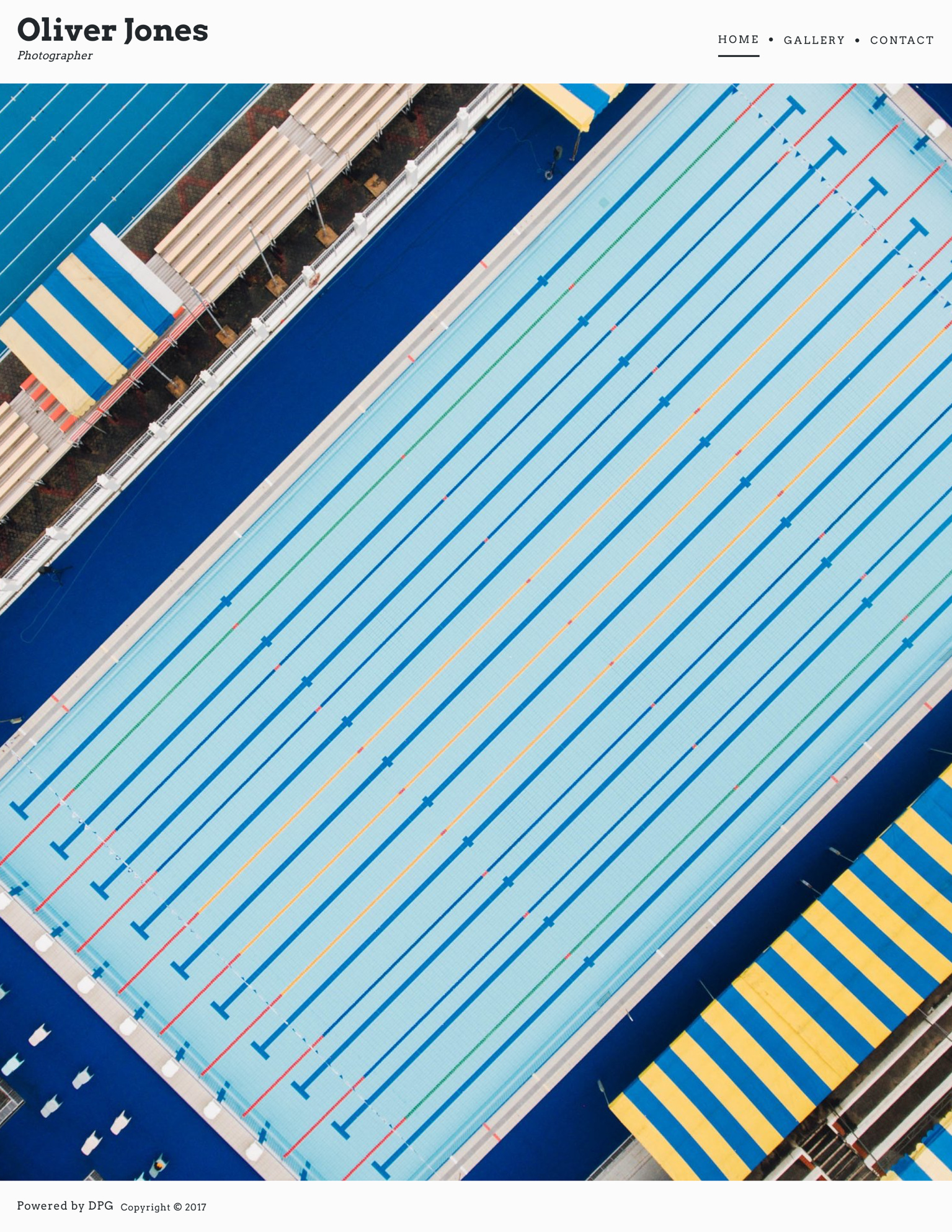
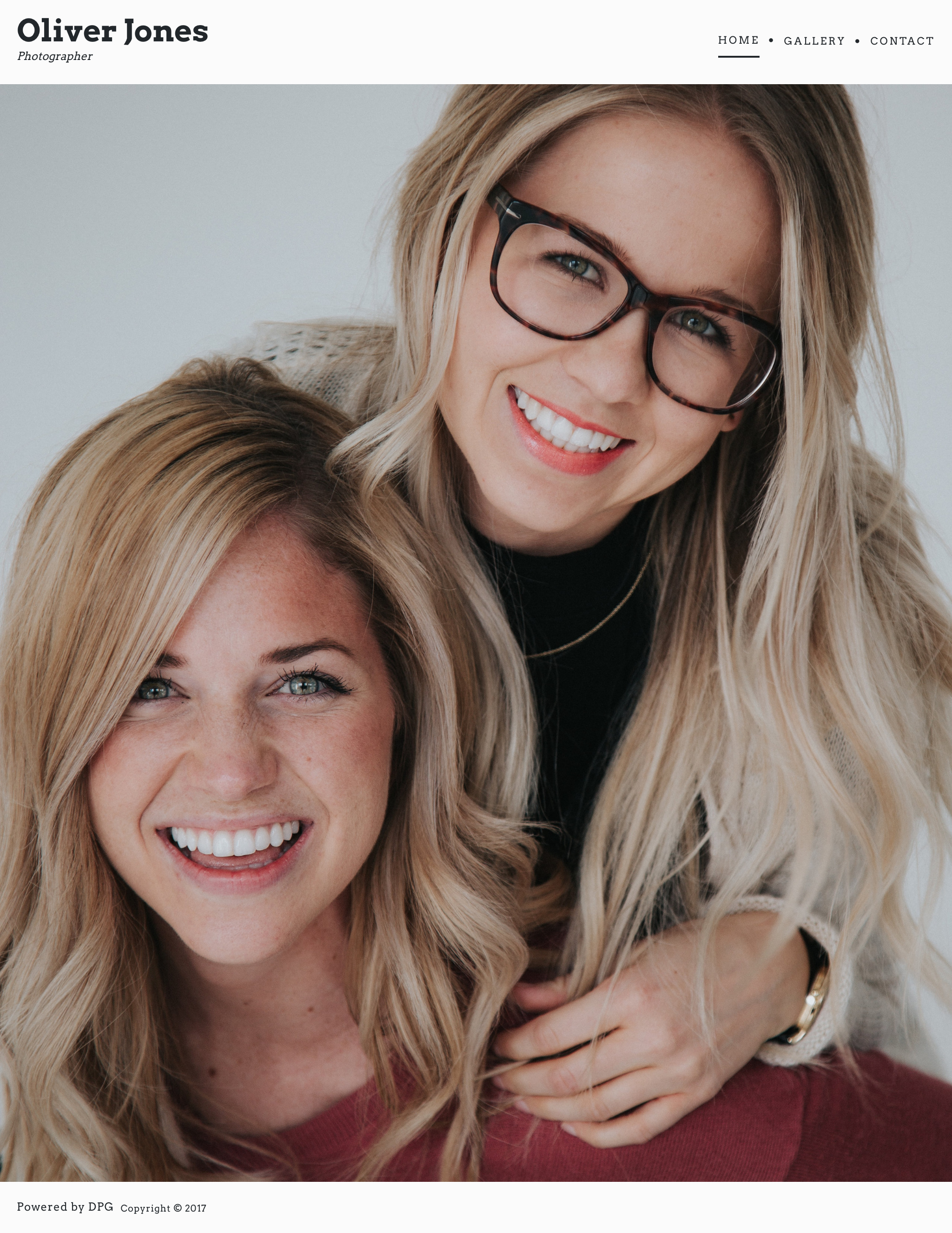
✅ Images where the focal point is in the centre scale well across all kinds of devices.
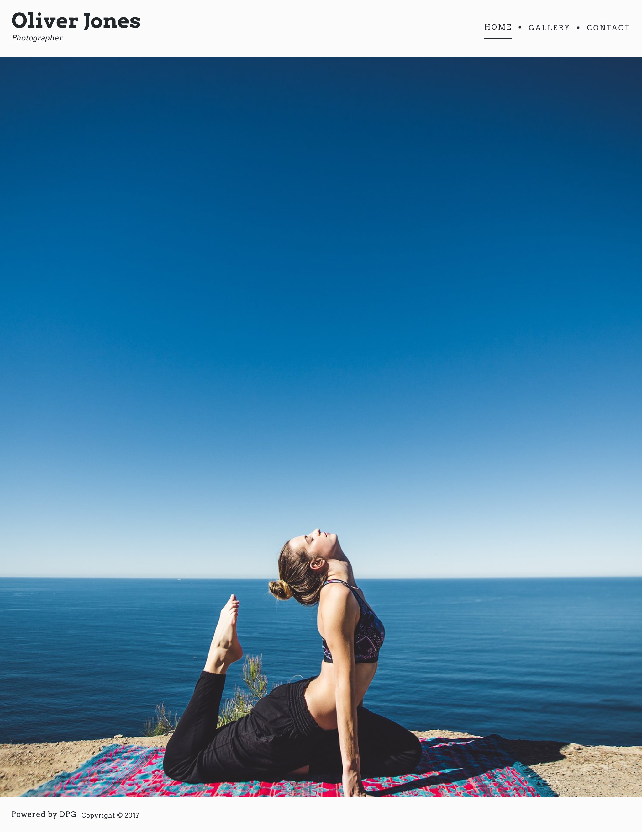
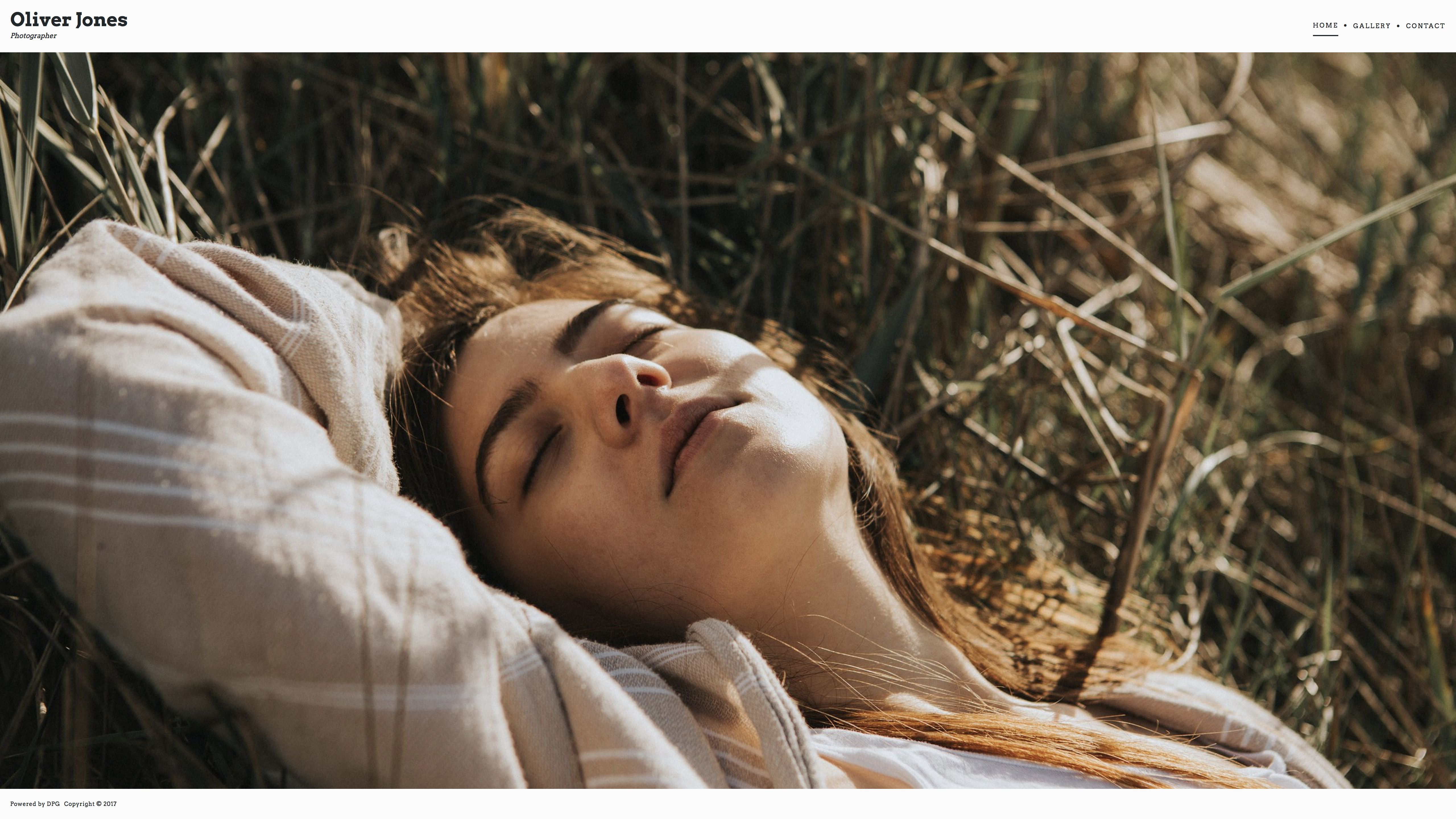
❌ Close cropped portraits can become too cropped when viewed on a landscape browser.
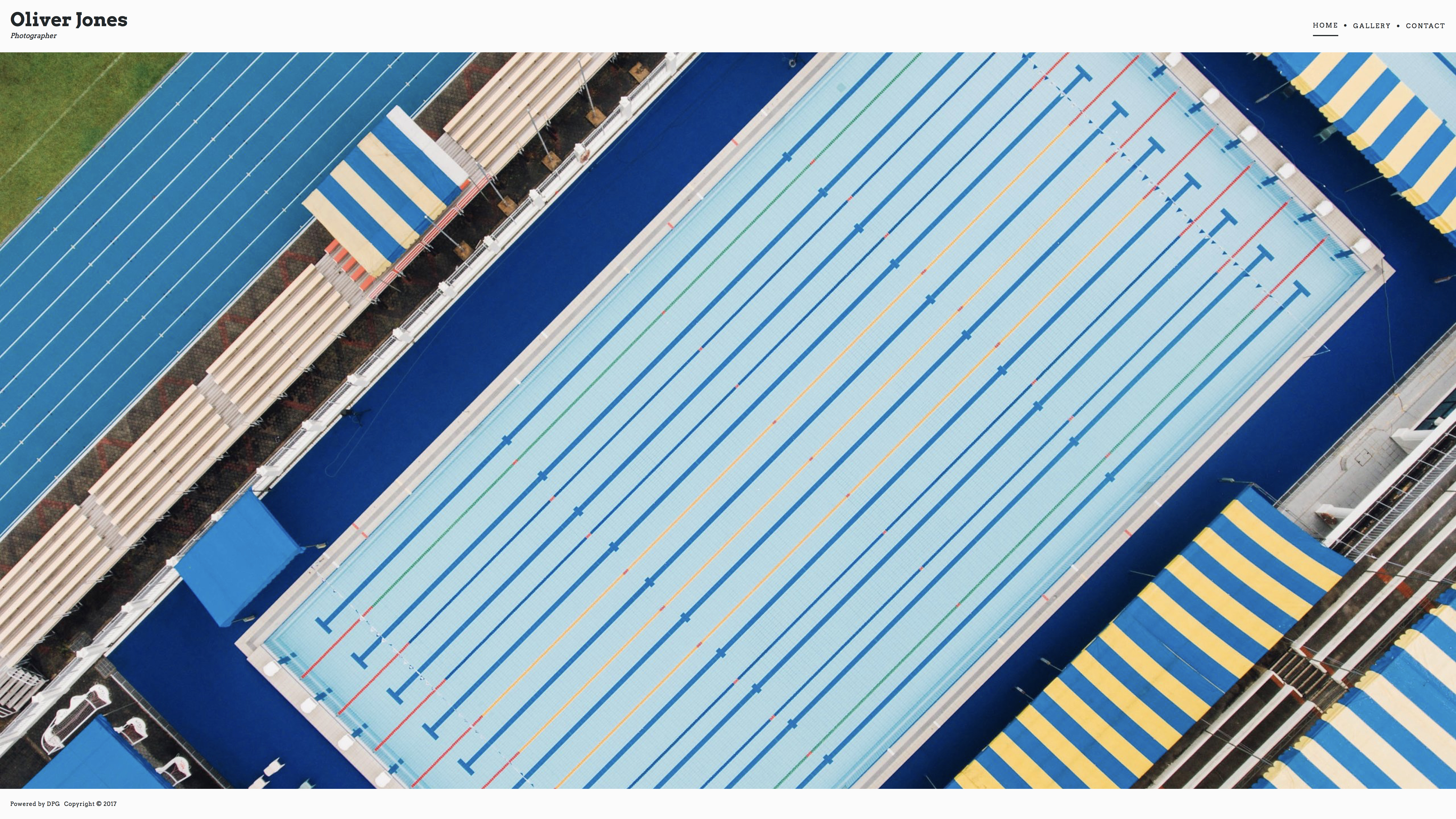
✅ Images which are a little more abstract look great in different aspect ratios too.