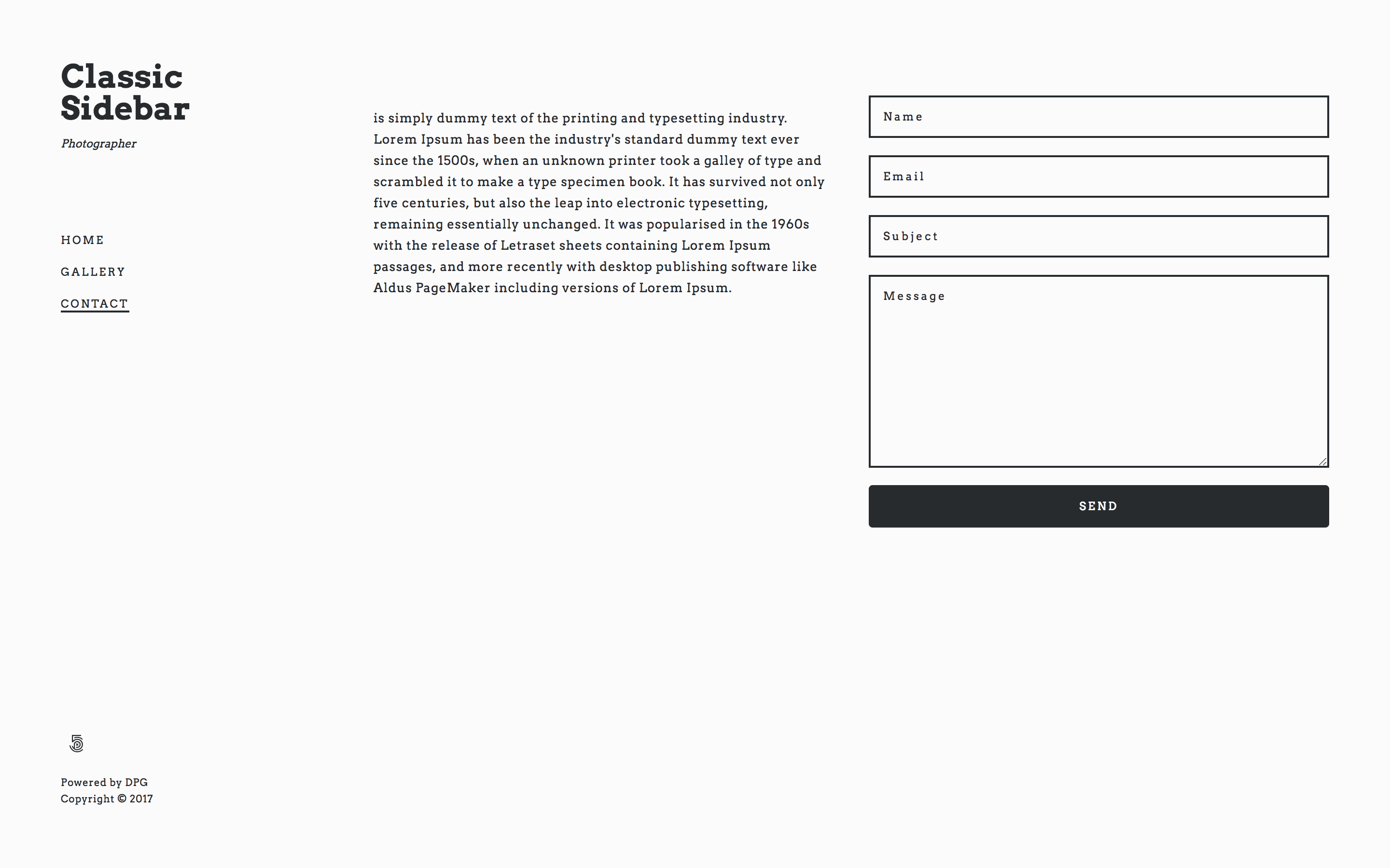
An example of a standard contact form.
Components - Contact Details
Overview
The Contact Details component allows you to add either contact details or a contact form to a page.
Custom Form Elements
Creation options
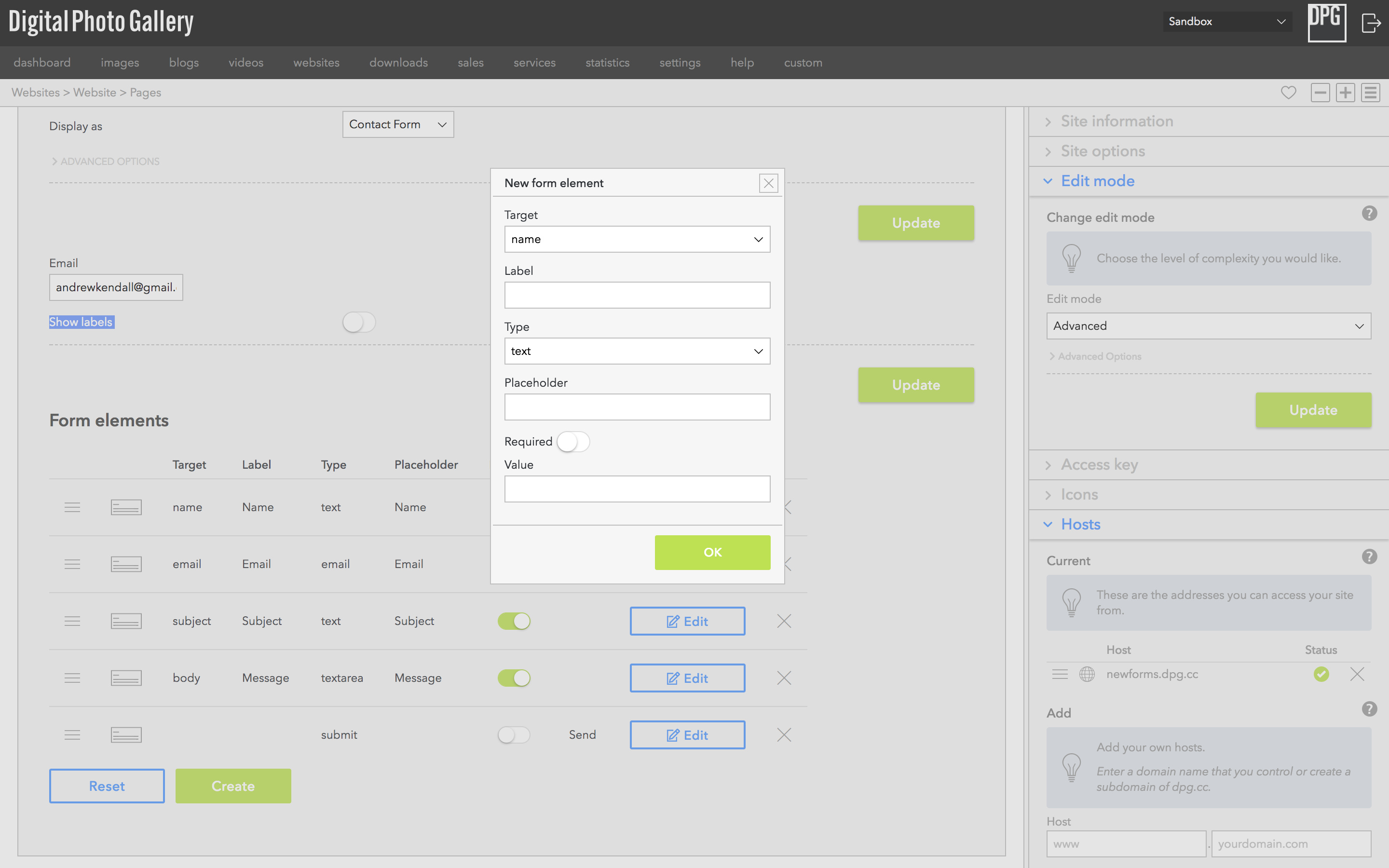
Click Create and you will see the dialog, the options are described below.
- Target This is the where the text entered by the end user will be placed in your email
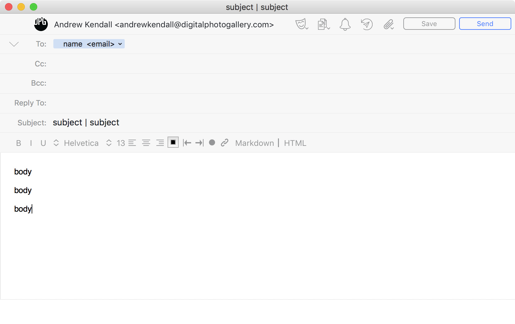
For the target option, here is an example of where the different options would show up in an email. You can add multiple title targets and they will be combined together, the same goes for adding multiple body targets.
You should always add an email target which is an email field, otherwise you won't be able to contact the sender of the message.
- Label This is the label that appears before the field in the form (Make sure Show labels option is enabled).
- Type This is the kind of form element you wish to create.
- Placeholder The greyed out text that will appear in the field when there is no other information entered.
- Required Whether the form can be submitted without this field being filed in.
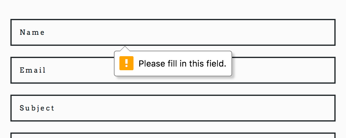
The warning shown to the user when trying to submit a form with an empty required field. This option relies on the browser's ability to validate forms.
- Value A default value for the field.
If you want to create a value that can't be changed, for example a pre-set subject which is the same for every message then use the Type hidden.