Essential Portfolio - Gallery hierarchy
Gallery pages have a hierarchy of views to present content for easy browsing. If you have a large body of work, it's a good idea to plan how you intend to group and organise it before getting started.
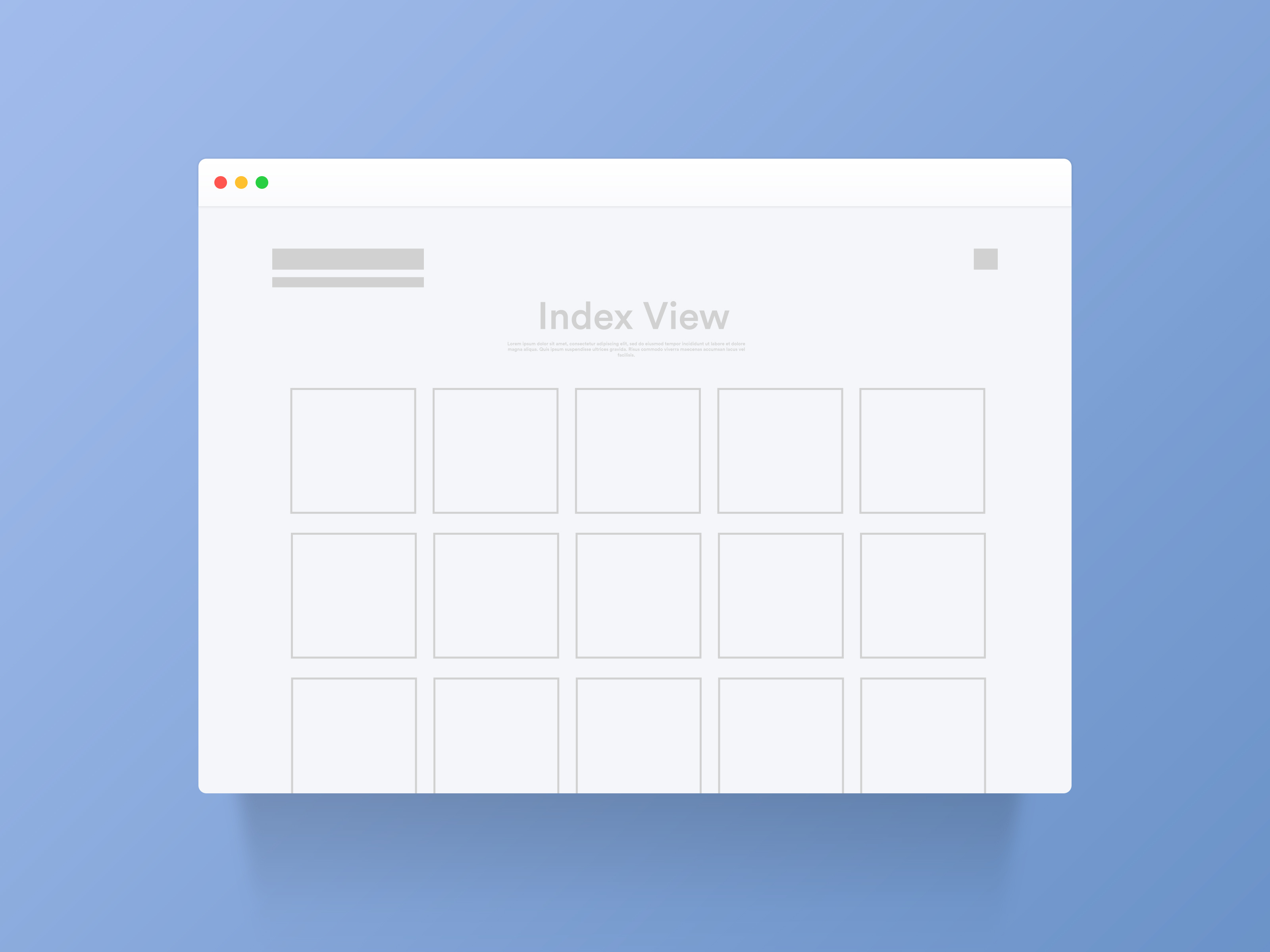
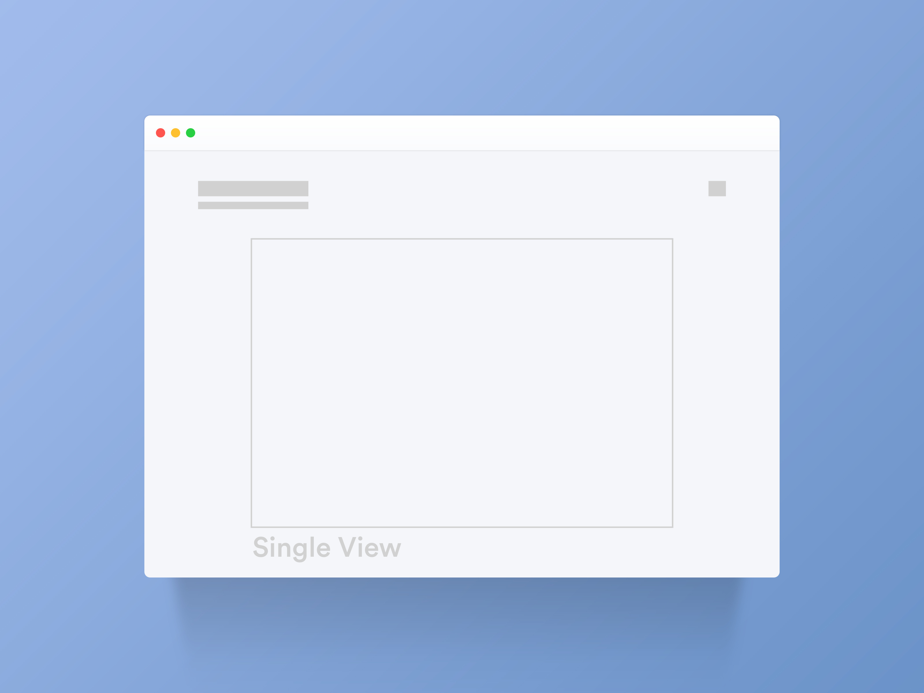
The gallery page is made up of three views: Sets View, Index View and Single View. Each view has different pre-set layouts which you can mix and match to create the gallery that's right for you.
Sets View

If you have a number of different projects, themes or categories to showcase, you can organise your images into sets.
Sets can be compared to folders in your operating system and can be nested within each other. For example, a Gallery set can contain a set called Weddings, which in turn could have a number of sets inside showing each different event. All the nested set views for that page will share the same layout.
You can display a title and description at the top of the set to provide more information about the gallery. In the list of sets to choose from, each can have its own title and description alongside the image (called the Set Cover).
↓
Index View

The Index view shows an overview of all the content in the gallery or set. This is the default appearance of the gallery page without any added sets.
Depending on the styles you choose, this can look like small thumbnails, large images to the edges of the page or even a one column stream.
You can display a title and description at the top of the Index view and show a title and description for each image.
↓
Single View
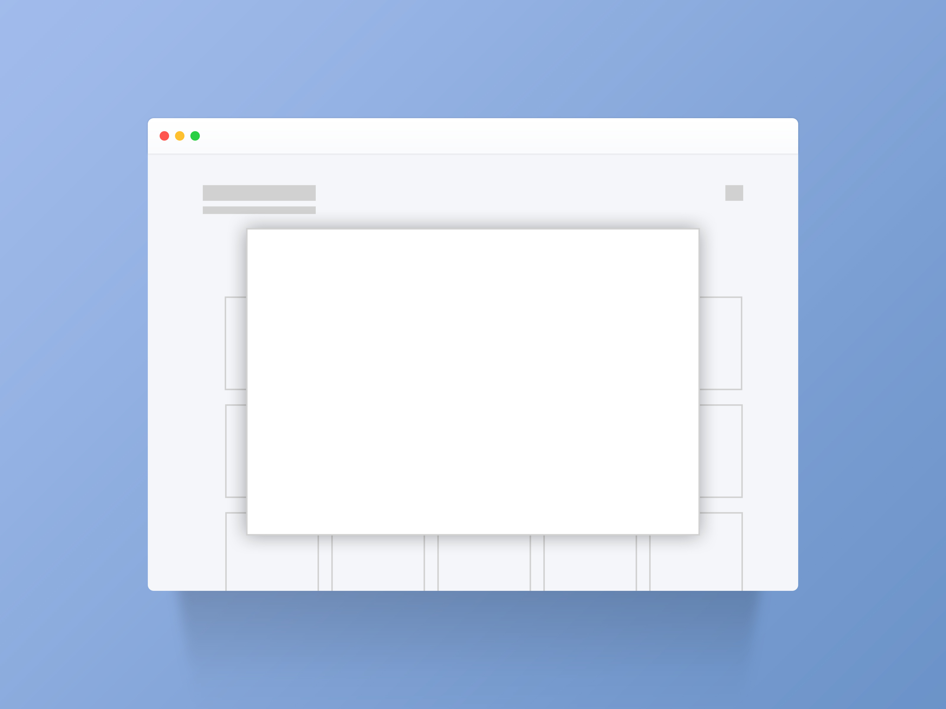
When you click on an image or video from the Index view, you'll see it in Single view. There are multiple single view and lightbox layouts to choose from.

