Essential Portfolio - Masonry layouts explained
Masonry is a style of grid layout where content is arranged in columns. This makes it a popular choice for image galleries, as images of different dimensions can be neatly arranged without gaps.
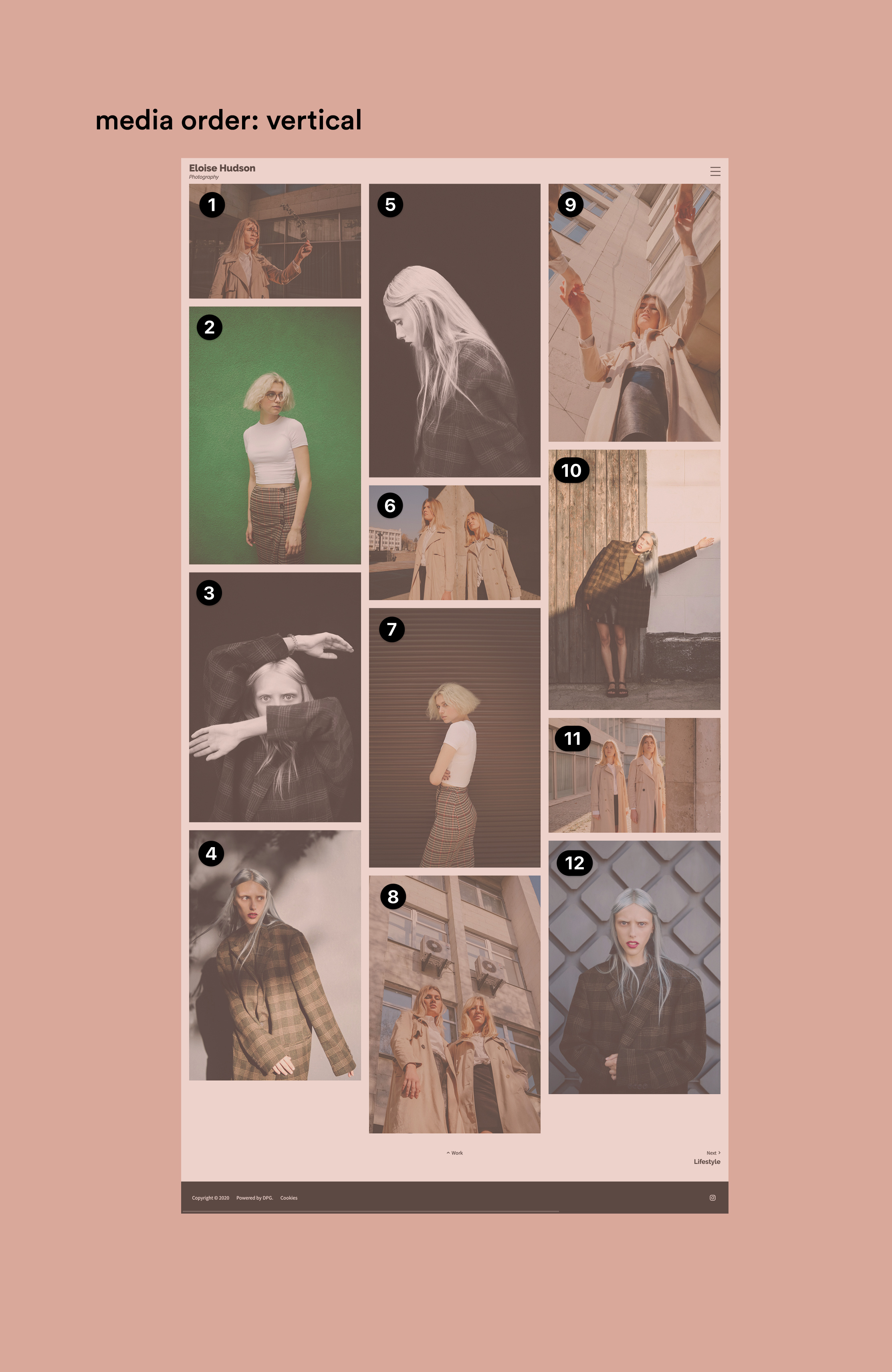
This is an example of a Masonry layout using the Essential Portfolio template (left).
DPG has previously used Masonry layouts in several Series 2 templates. With Series 3, we have rewritten Masonry using the latest web technologies to improve its functionality. Because of this, Series 3 Masonry works slightly differently.
What's new?
In Series 3, the Essential Portfolio template has two different masonry layouts - Masonry and Horizontal Masonry.
If you are used to the function of masonry from previous templates, the first change you might notice is the order of images on the page with the Masonry layout. Read on to find out about the difference.
Column fill
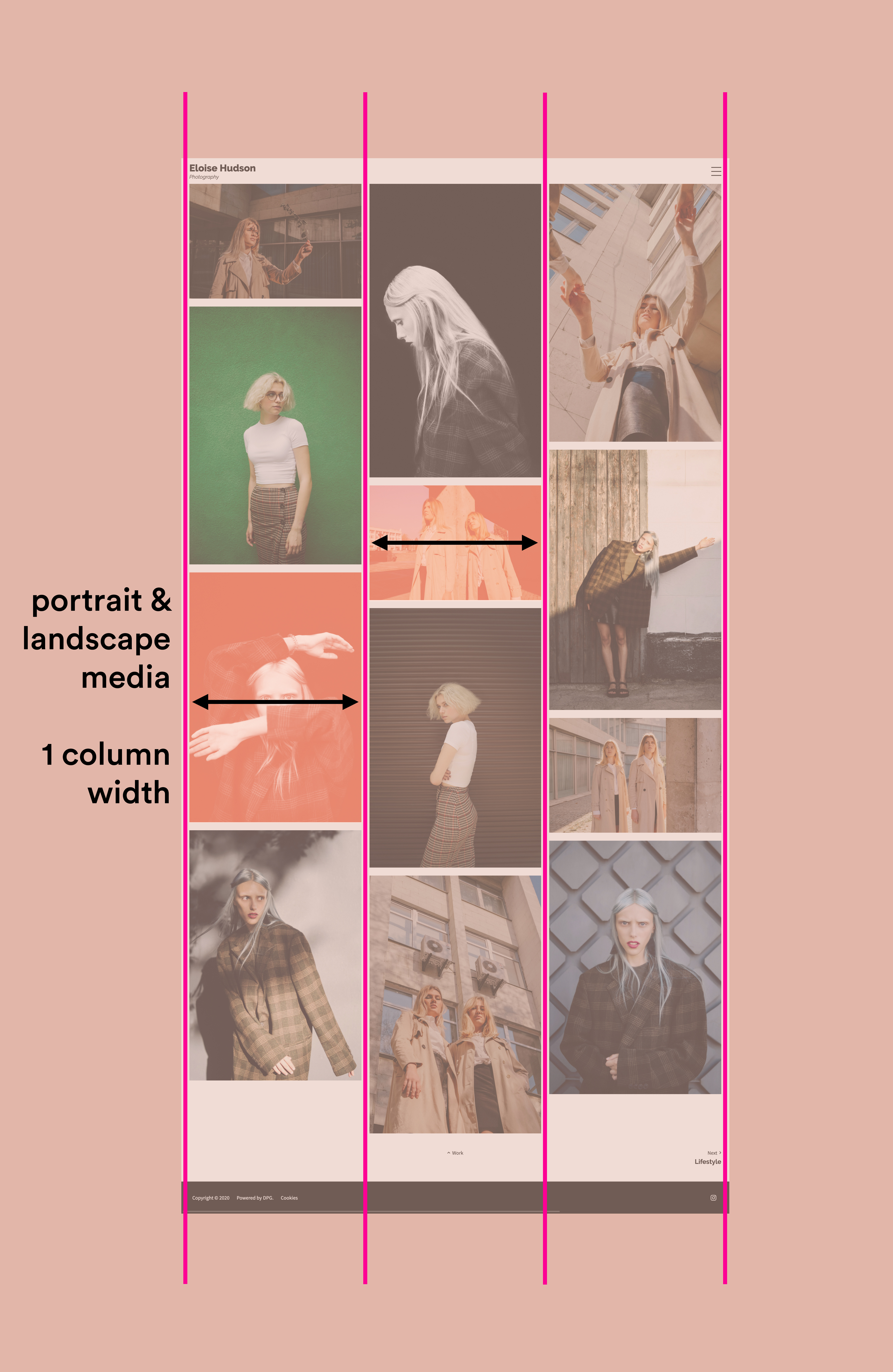
In Masonry you choose the number of columns and the total number of images in the set is divided across these columns. The images are constrained by the width of the column, so portrait images are shown larger than landscape ones.
If all your images don't share exactly the same dimensions, the bottom of the gallery won't be perfectly even.
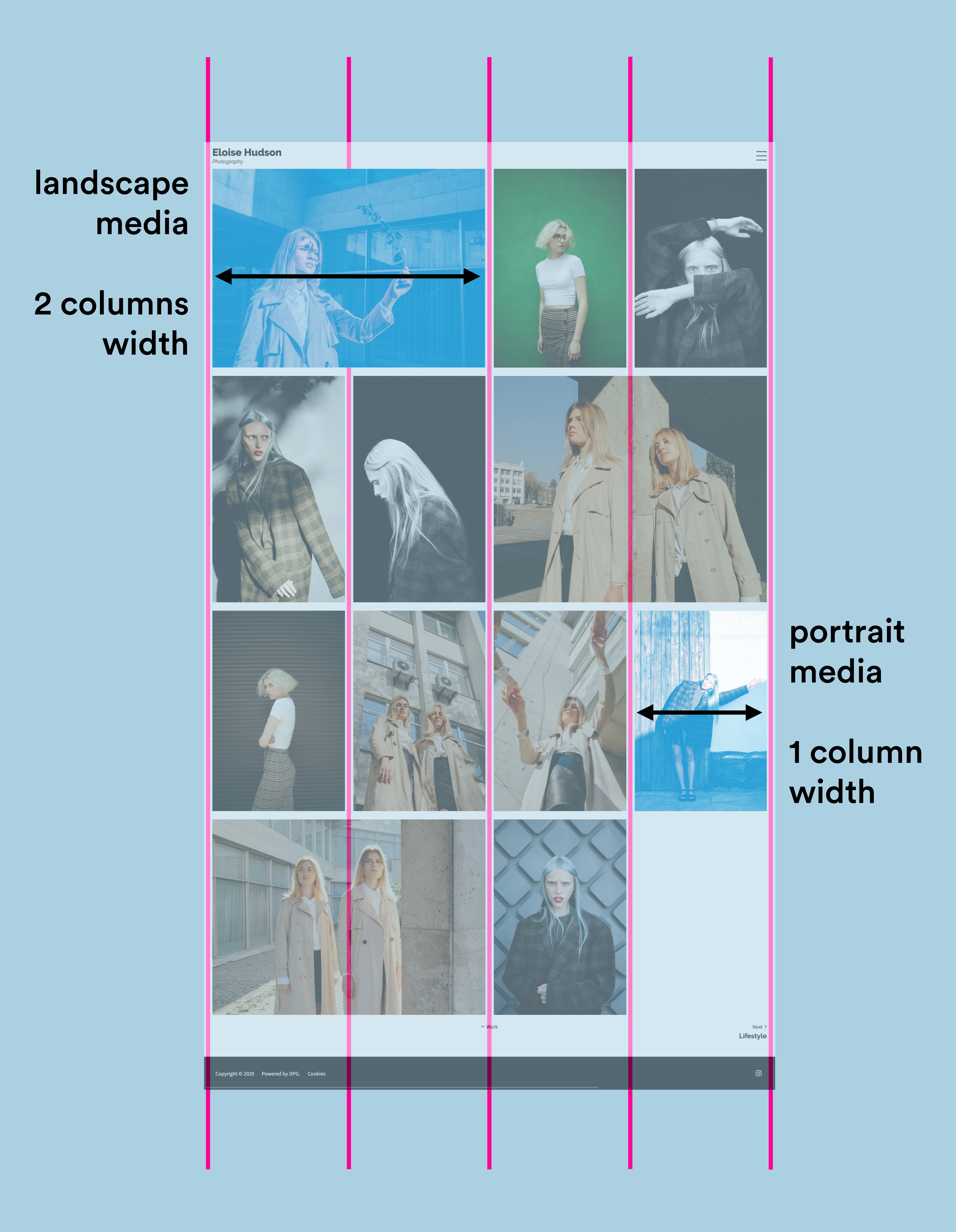
In Horizontal Masonry portrait images fill 1 column, while landscape images fill 2 columns. The height of rows within the columns is consistent, so images with irregular dimensions (very tall portraits, very wide landscapes) will be cropped slightly to conform to the grid.
If the number of images in the set doesn't fill all of the column "slots" you may have gaps at the bottom of the gallery.
Masonry runs in downward columns. As the example on the left shows, images start in the first column stacking underneath vertically until they hit the bottom, then the next image appears at the top of column two and so on.
❗️This is the primary difference in behaviour from Series 2 masonry, where image 1 started in column 1, then image 2 appeared in column 2.
❗️This means that the custom order of images for this layout can be difficult to control in the Admin, where the grid displays them in horizontal rows.
To prevent confusion, it's best to arrange the order of the Masonry layout using the Design section, where you can simply click and drag them freely into custom order across columns.
📎 Read more about arranging images using the Design section.
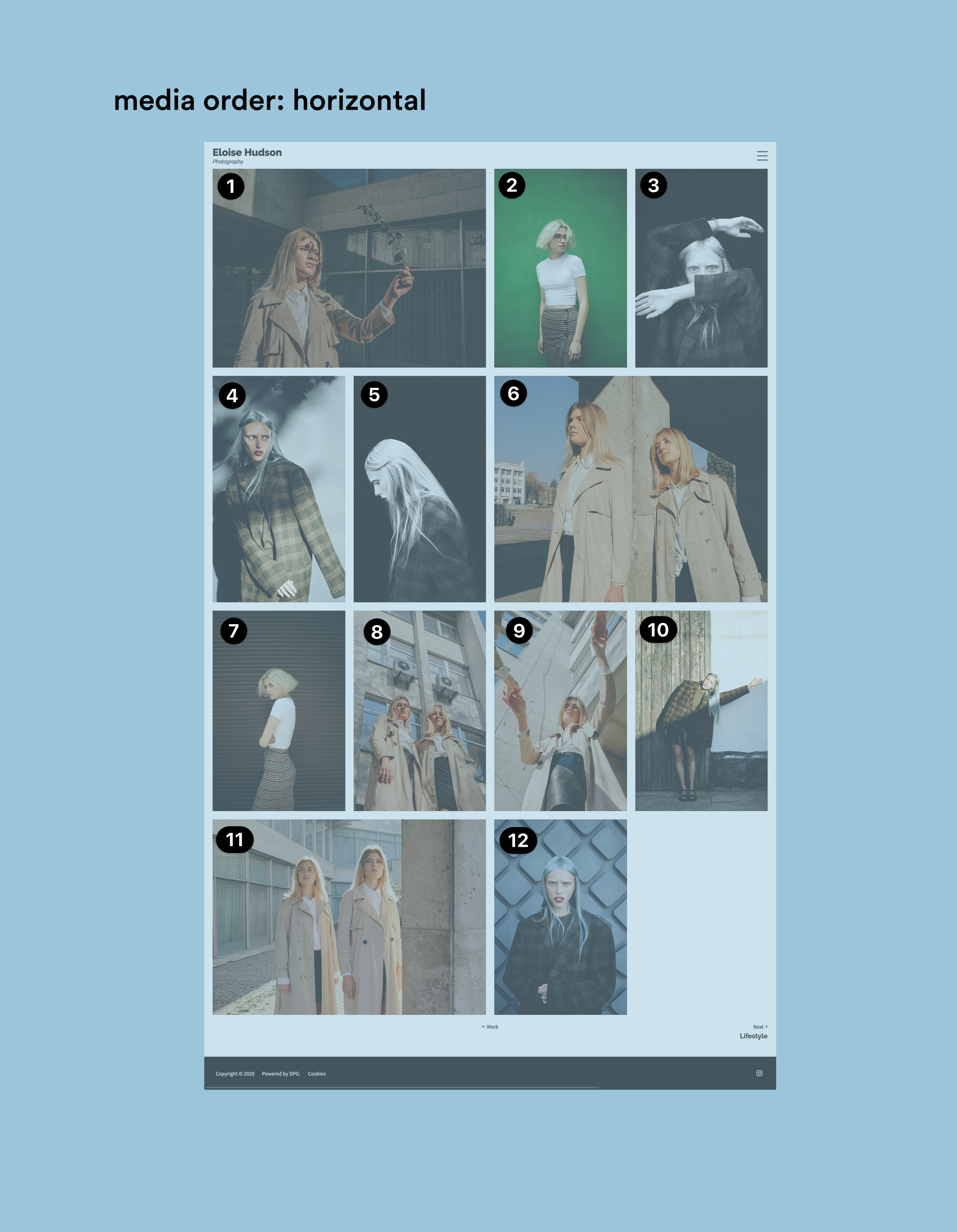
Horizontal Masonry on the other hand, follows a horizontal order. You can still arrange it in the Design section, but the order will be recognisably the same in sets view.
