Set Information can appear underneath, or on top of the Set Cover on hover.
Essential Portfolio - Gallery page styles
The Essential Portfolio Gallery page is designed to be flexible and easy to customise so that you can tailor it to your own work. We've created a number of preset layout styles to make it easy to change the appearance of the gallery with one click. Within these layouts, you can make endless customisations which are visually controlled by sliders in the Design editor.
The Gallery page has three views - Sets View, Index View and Single View. This hierarchy allows you to present your work in sets by project, style, or any other grouping you choose. Each view's layout is independent of the others, so you can mix and match the appearance of the gallery at each stage.
📎 Read more about Gallery views.
This article aims to show you an overview of the different layout styles for each of the views. Layouts are defined by the different characteristics that each applies to the gallery, such as the aspect ratio of the images or the direction of masonry flow.
🎨 Customise it - You can always change the number of columns, padding, hover styles, colours and typography for all the layouts. Below, we've highlighted some further tips to get the most from each style. Don't worry, it's super easy with no coding needed.
Sets View
Use sets to divide your work into projects or categories to make it easy for visitors to navigate. You can create as many nested sets as you like, for example:
📁Work → 📁Commissioned → 📁Brands → 📁Bentley.
There are 6 Sets View styles:
- Square Grid
- Regular Grid
- Masonry
- Uniform Grid
- List
- Slide
Square Grid
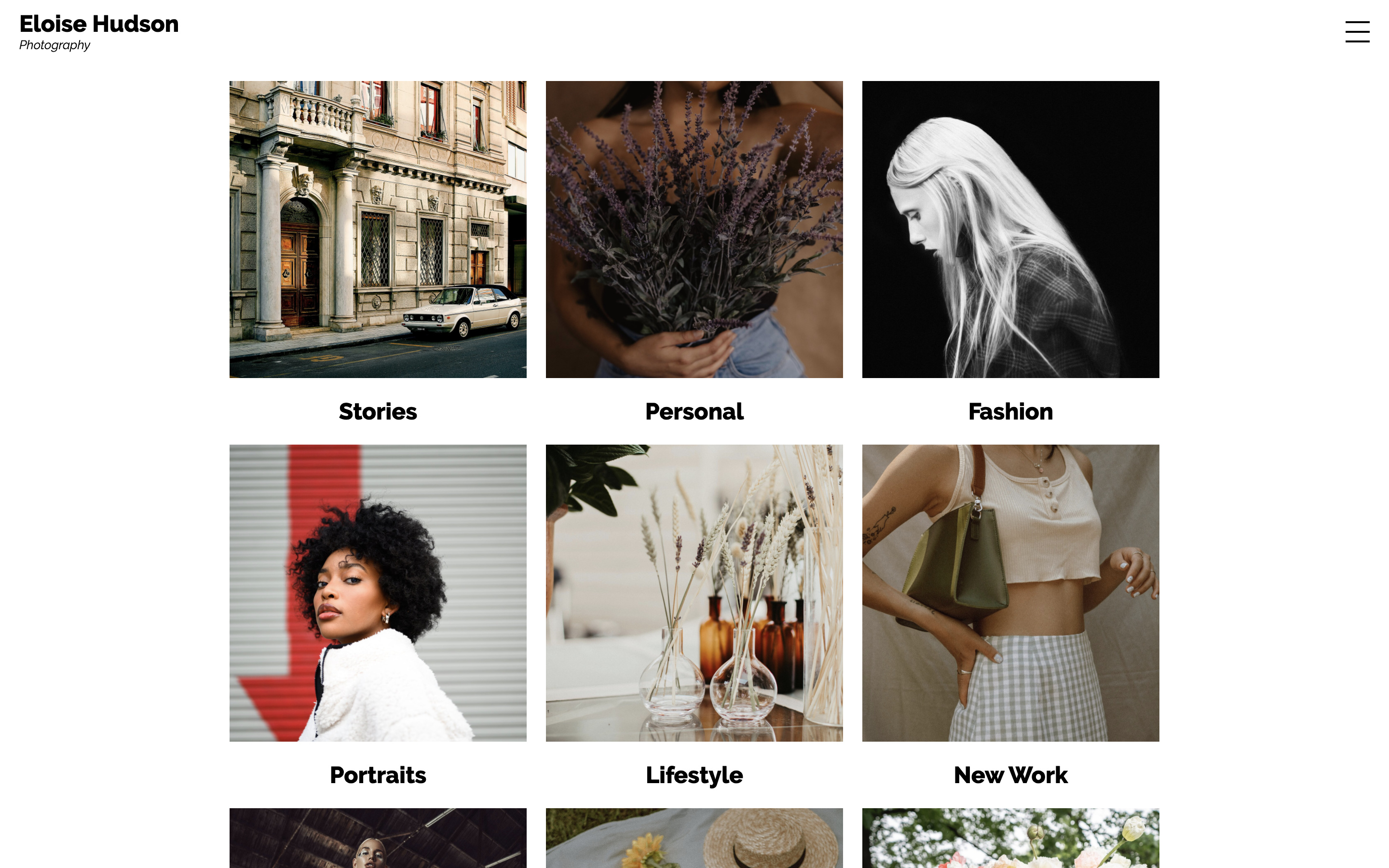
Set Information can appear underneath, or on top of the Set Cover on hover.
🎨 Customise it - large square Set Covers in two columns create a bold look.
Regular Grid
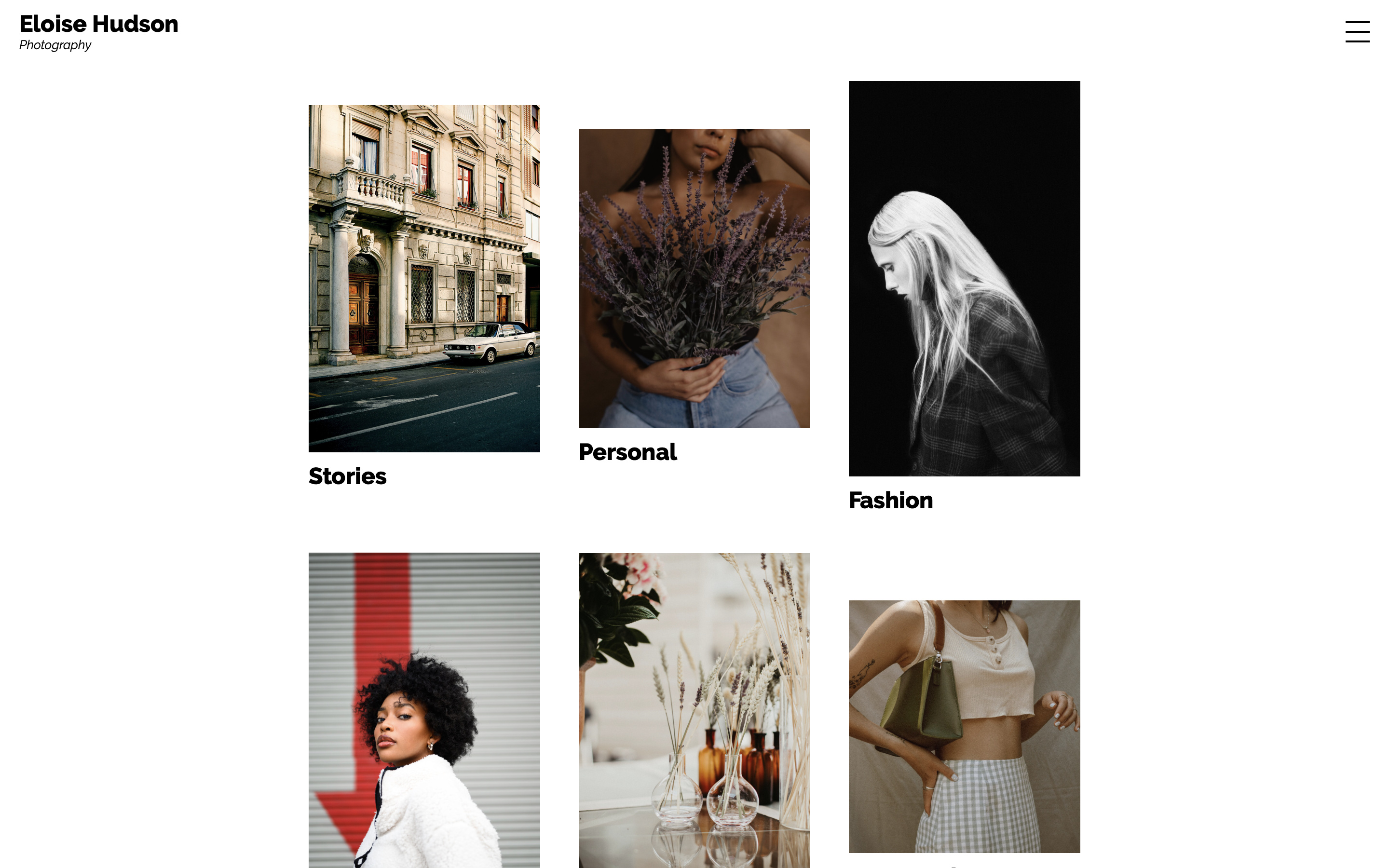
Set Information can appear underneath, or on top of the Set Cover on hover.
🎨 Customise it - smaller Set Covers with roomy padding create a modern and minimal look.
Masonry
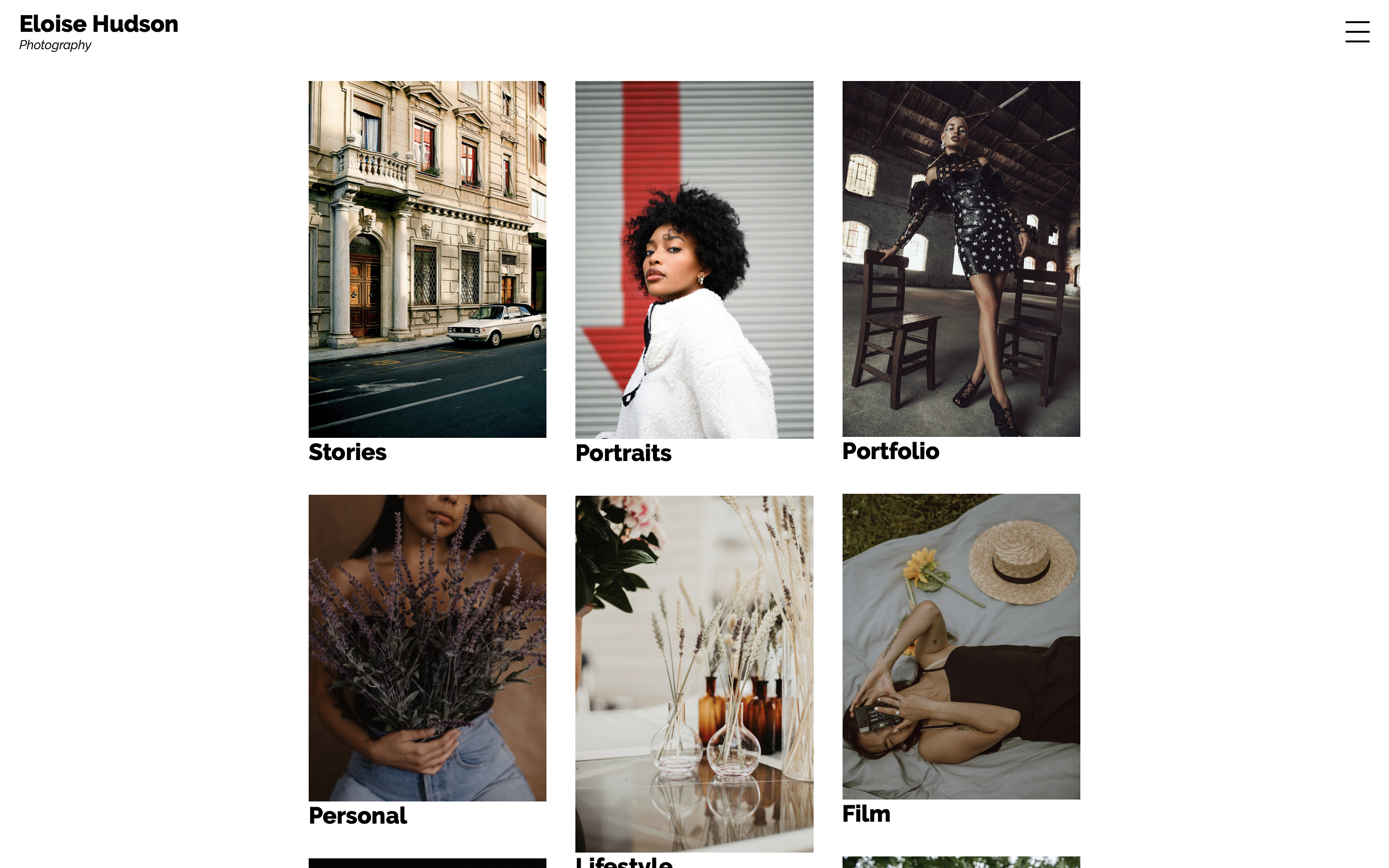
Set Information can appear underneath, or on top of the Set Cover on hover.
🎨 Customise it - large Set Covers with no padding can create impactful Masonry galleries.
Uniform Grid
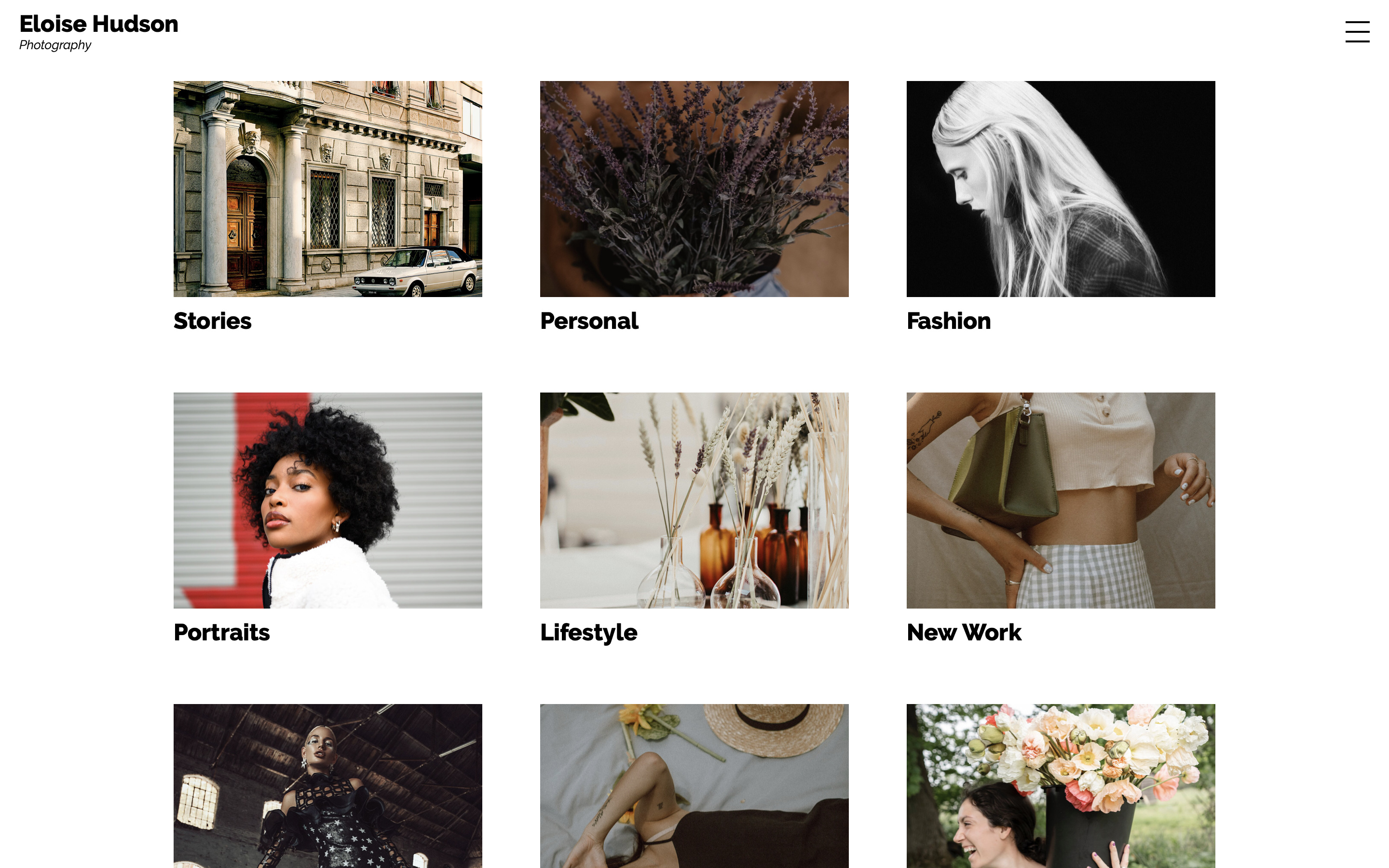
Set Information can appear underneath, or on top of the Set Cover on hover.
🎨 Customise it - Drop the number of columns to 1 to make wide full-width banners, or increase the media height to make cards.
List
Slide
Index View
The Index view shows you a wider overview of everything in any set. Whether you want to show a gallery of smaller thumbnail, or the full large image - there's a layout for that.
There are 6 Index View styles:
- Square Grid
- Regular Grid
- Masonry
- Horizontal Masonry
- Stream
- Horizontal Scrolling
Square Grid
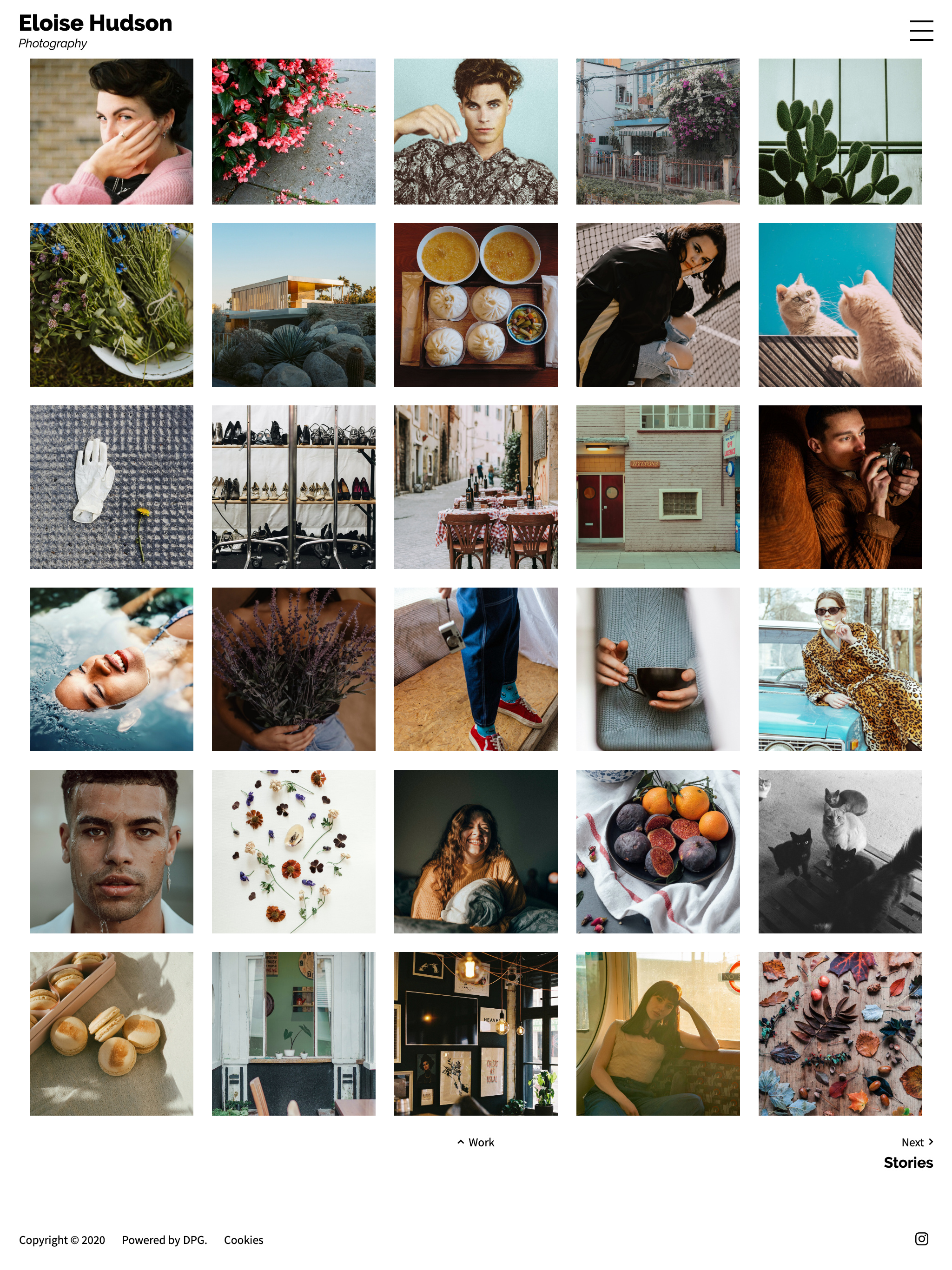
Image information can be on top of the image on hover, or hidden.
Regular Grid
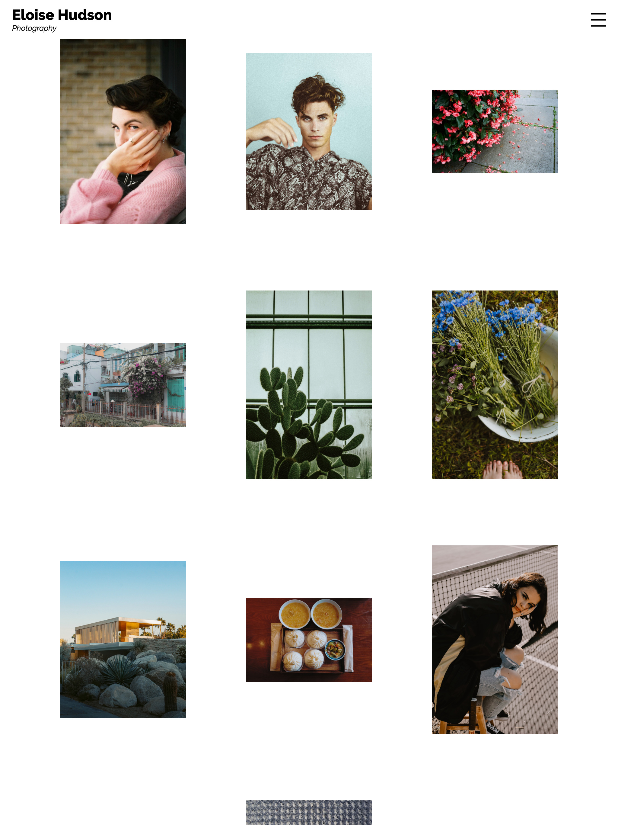
Image information can be underneath, on top of the image on hover, or hidden.
Masonry
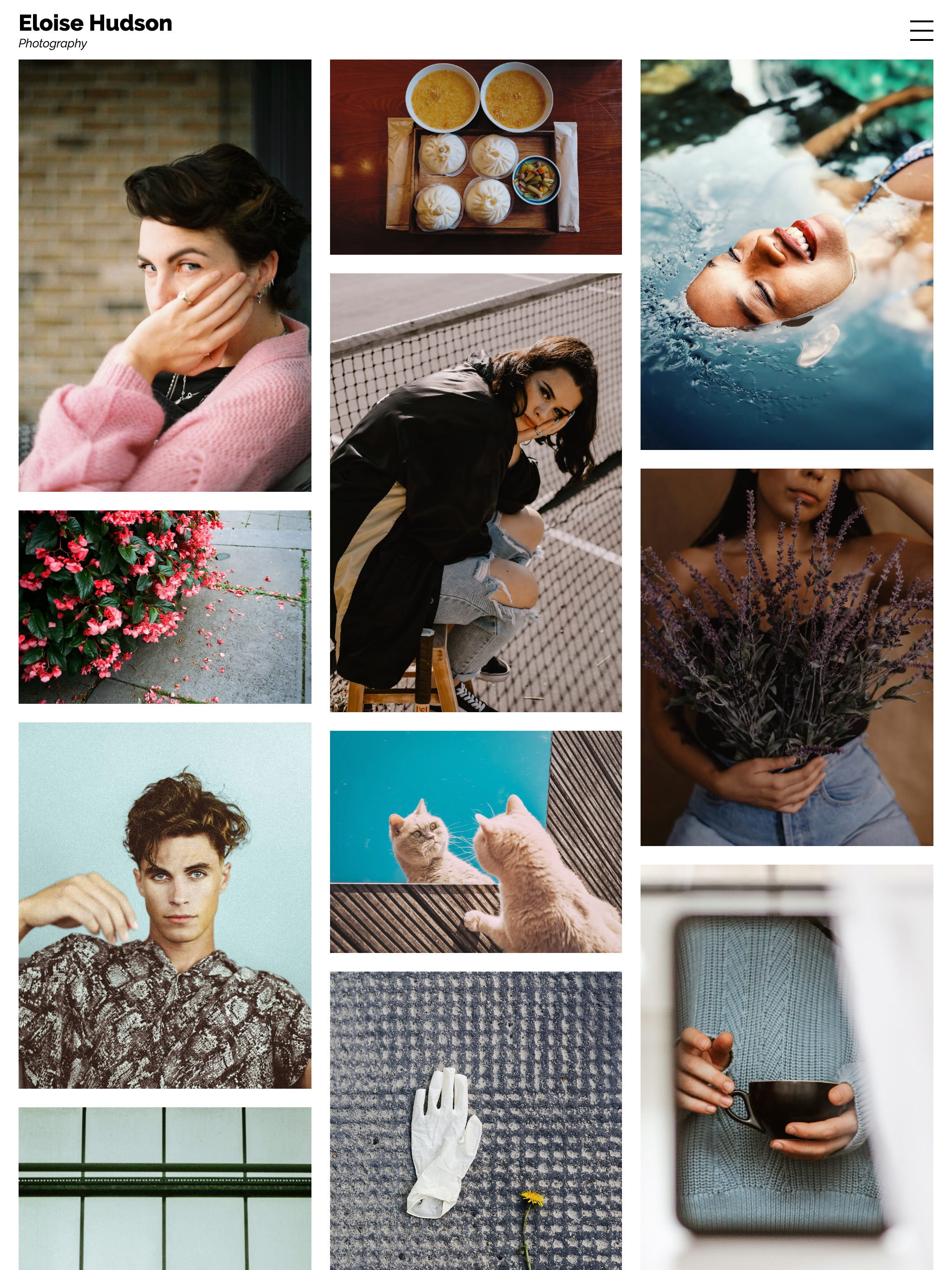
Image information can be underneath, on top of the image on hover, or hidden.
Horizontal Masonry
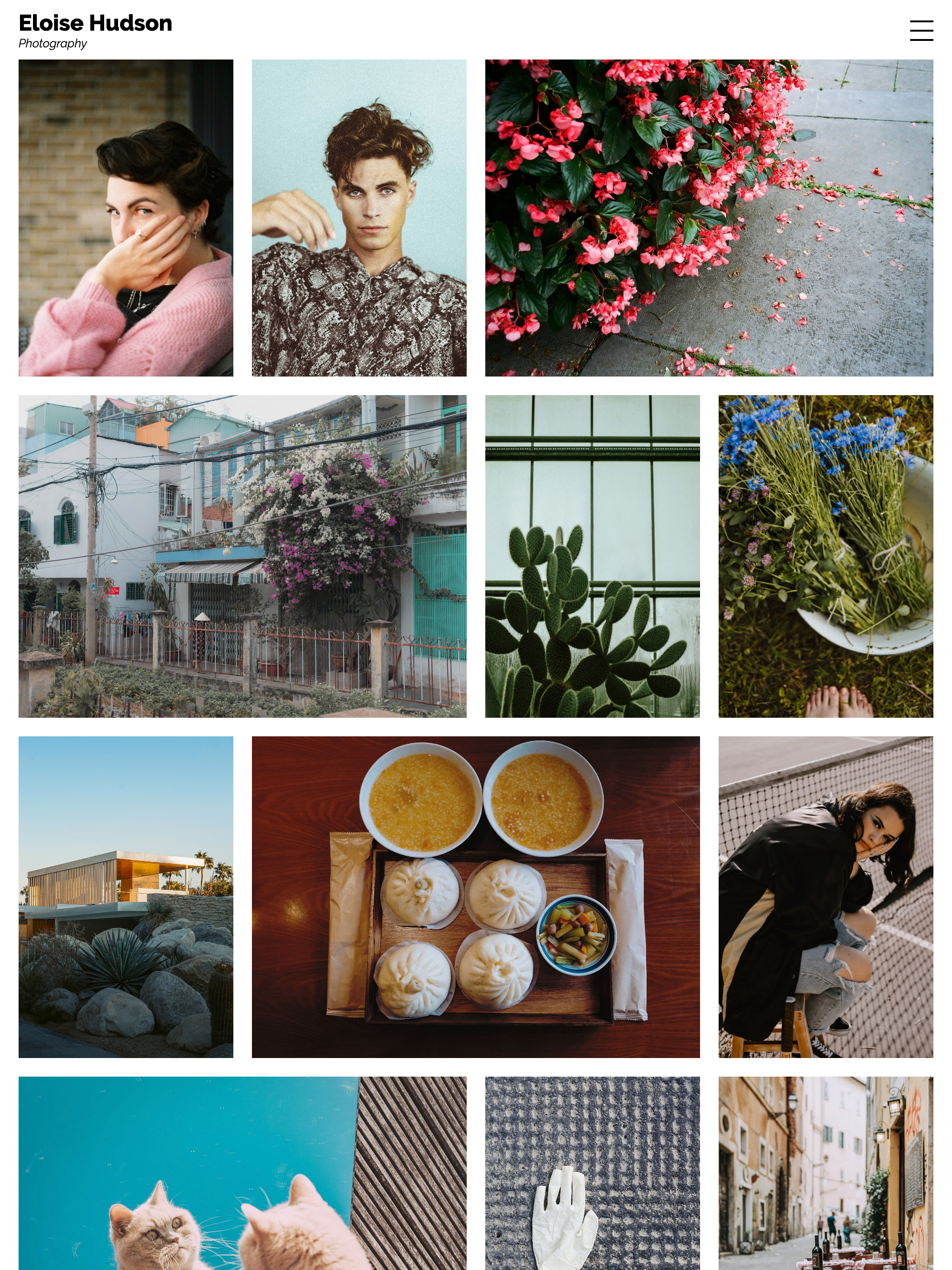
Image information can be on top of the image on hover, or hidden.
Stream
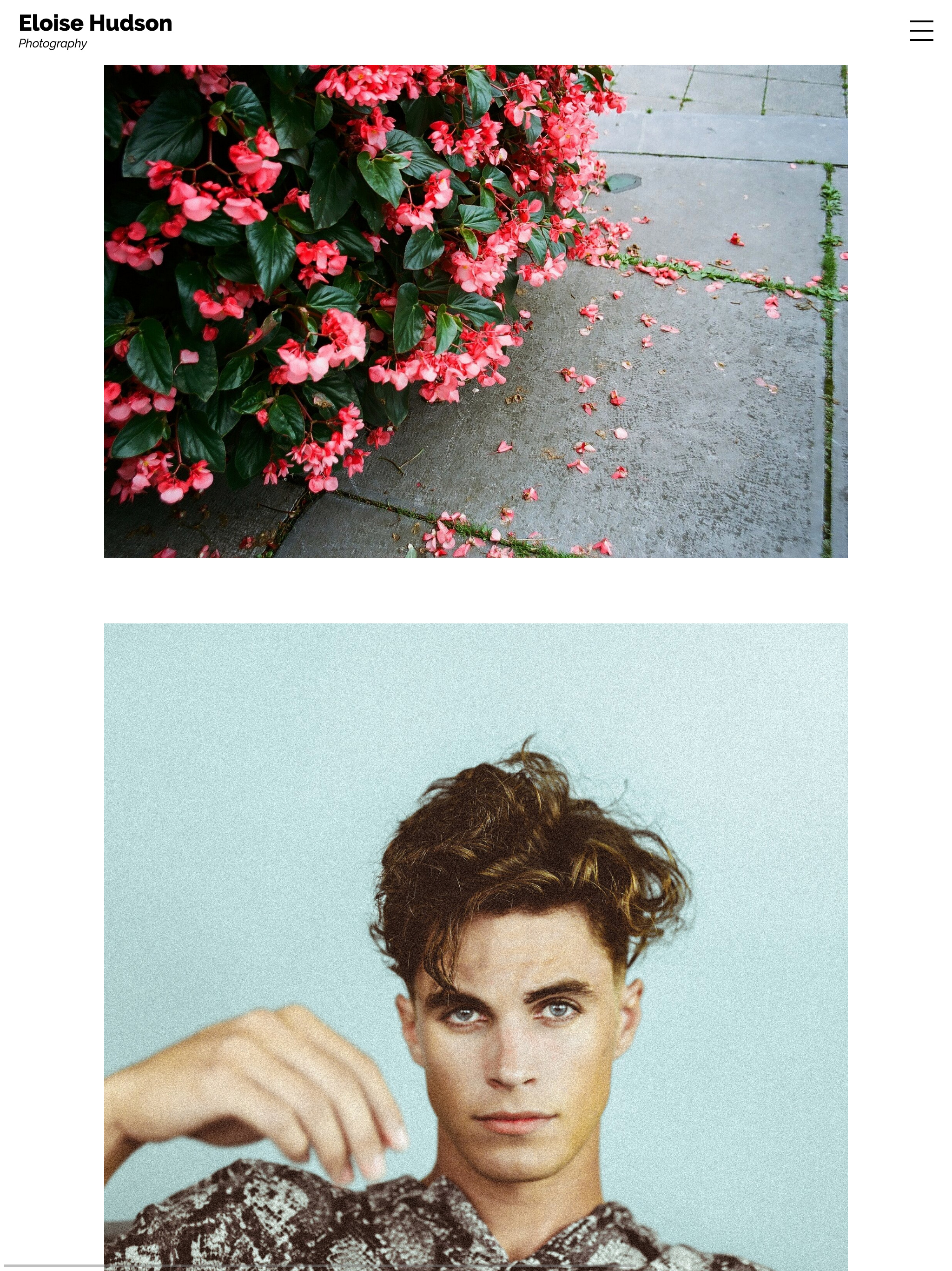
Image information is shown underneath the image.
Horizontal Scrolling
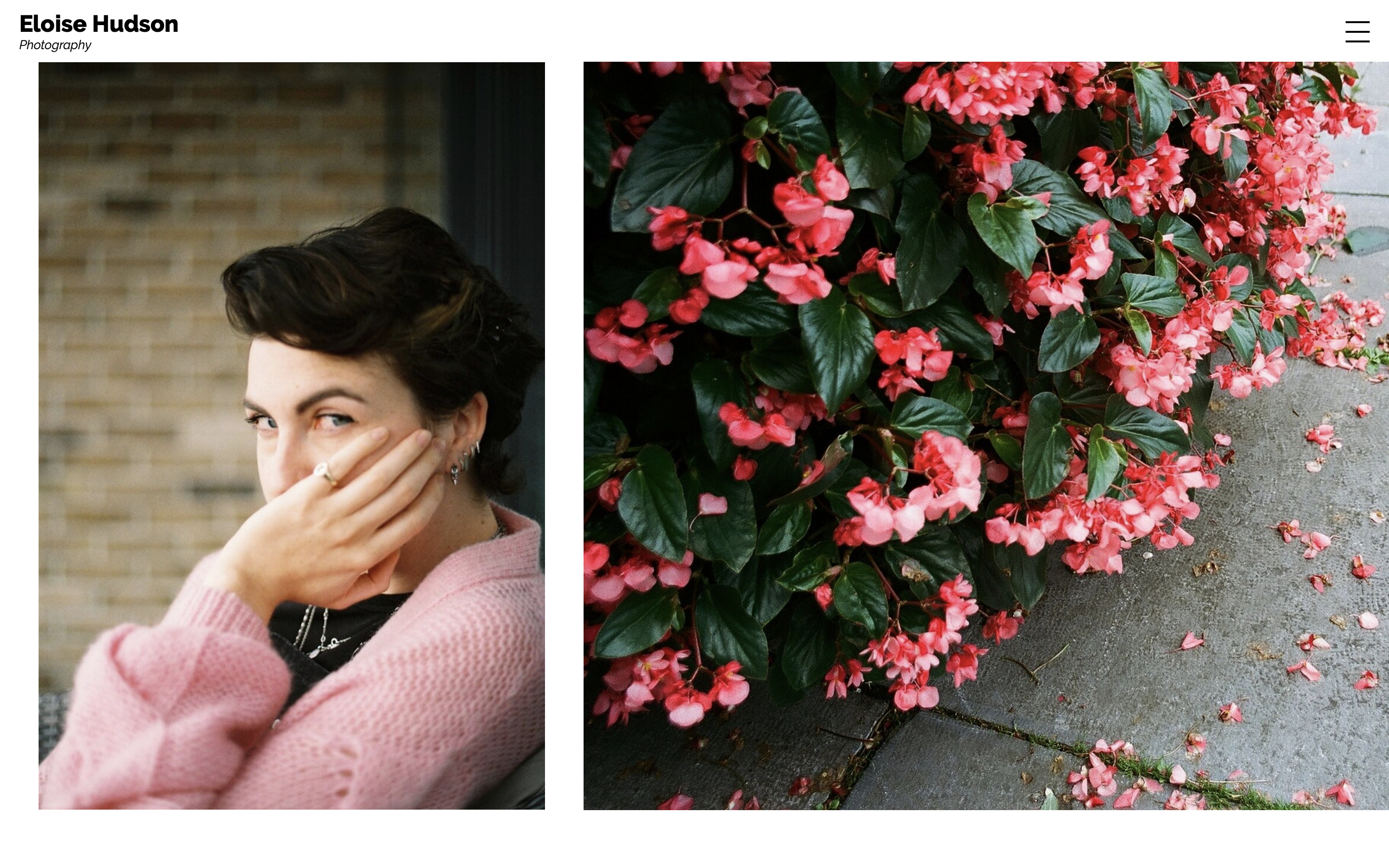
Image information is shown underneath the image or hidden.
Single View
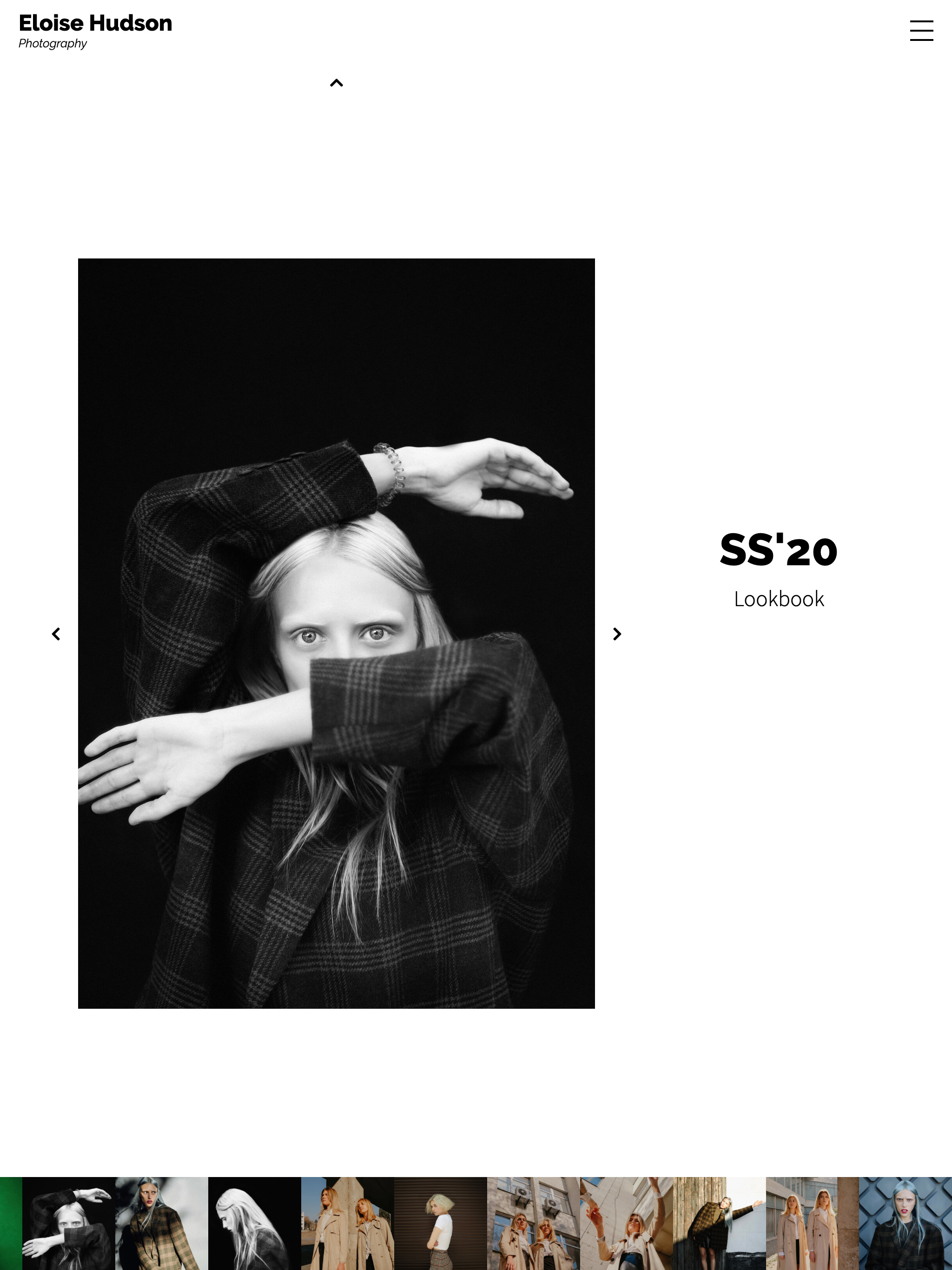
The Single view puts the individual image into the spotlight. You might choose this view to display images as large as possible with no distractions, or to provide more information about the work with titles, descriptions, keywords and other metadata.
There are 3 Single View styles:
- Fullscreen
- Stacked
- Panels
and 2 lightbox styles:
- Frame
- Minimal
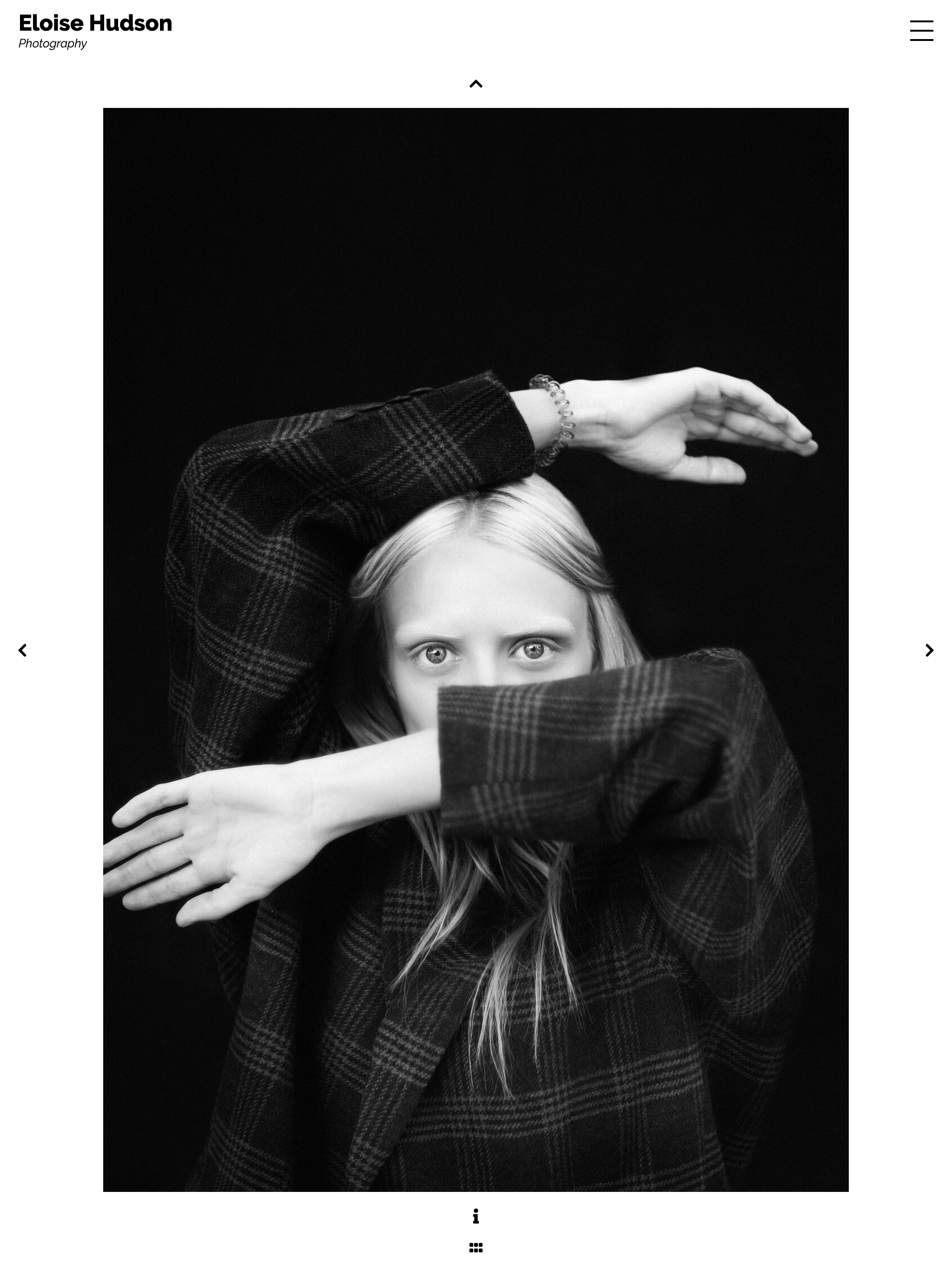
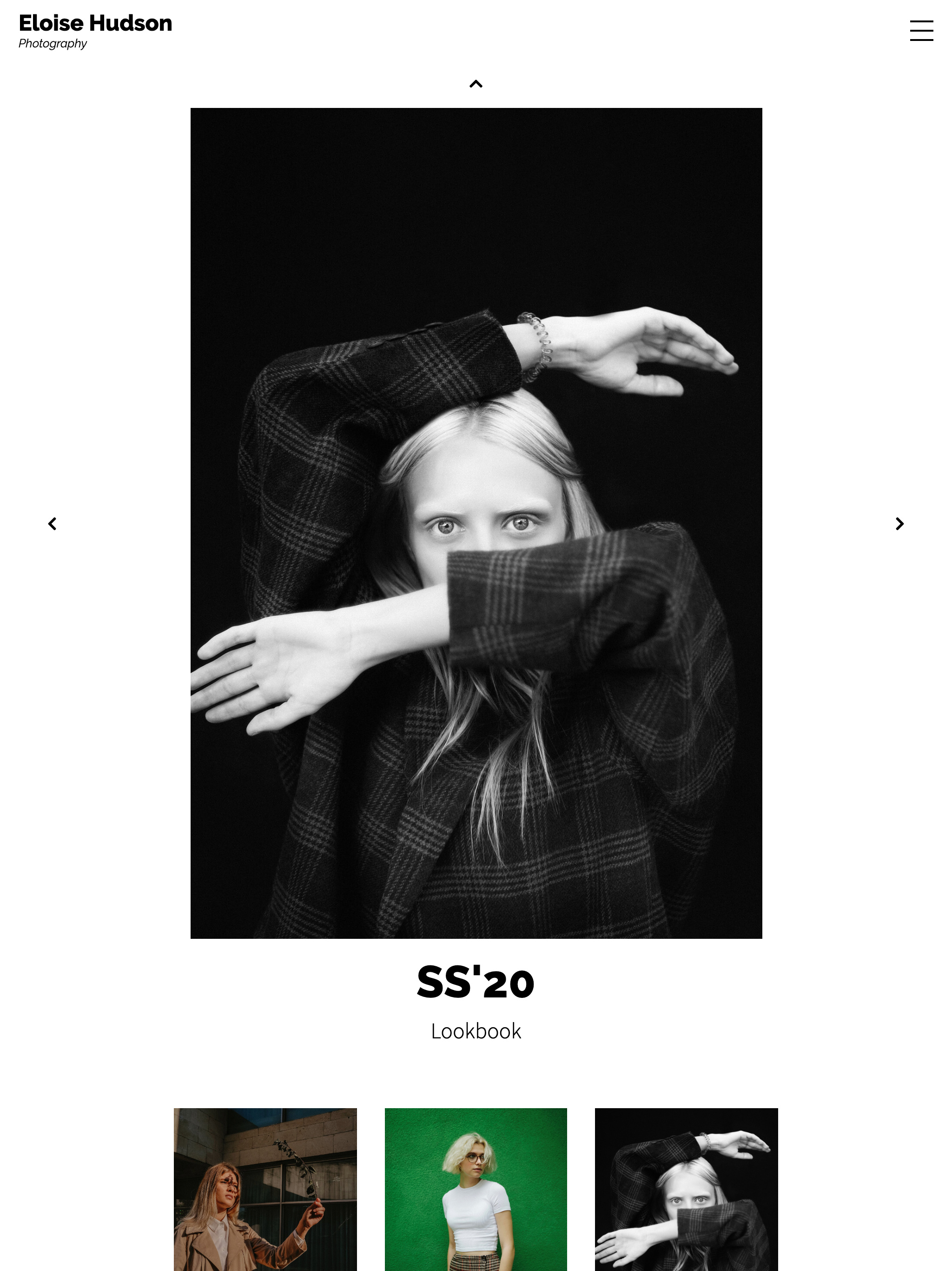
Single View Lightbox
With lightbox enabled, images pop up over the index view instead of loading as a separate page.
📎 Read more about the lightbox.
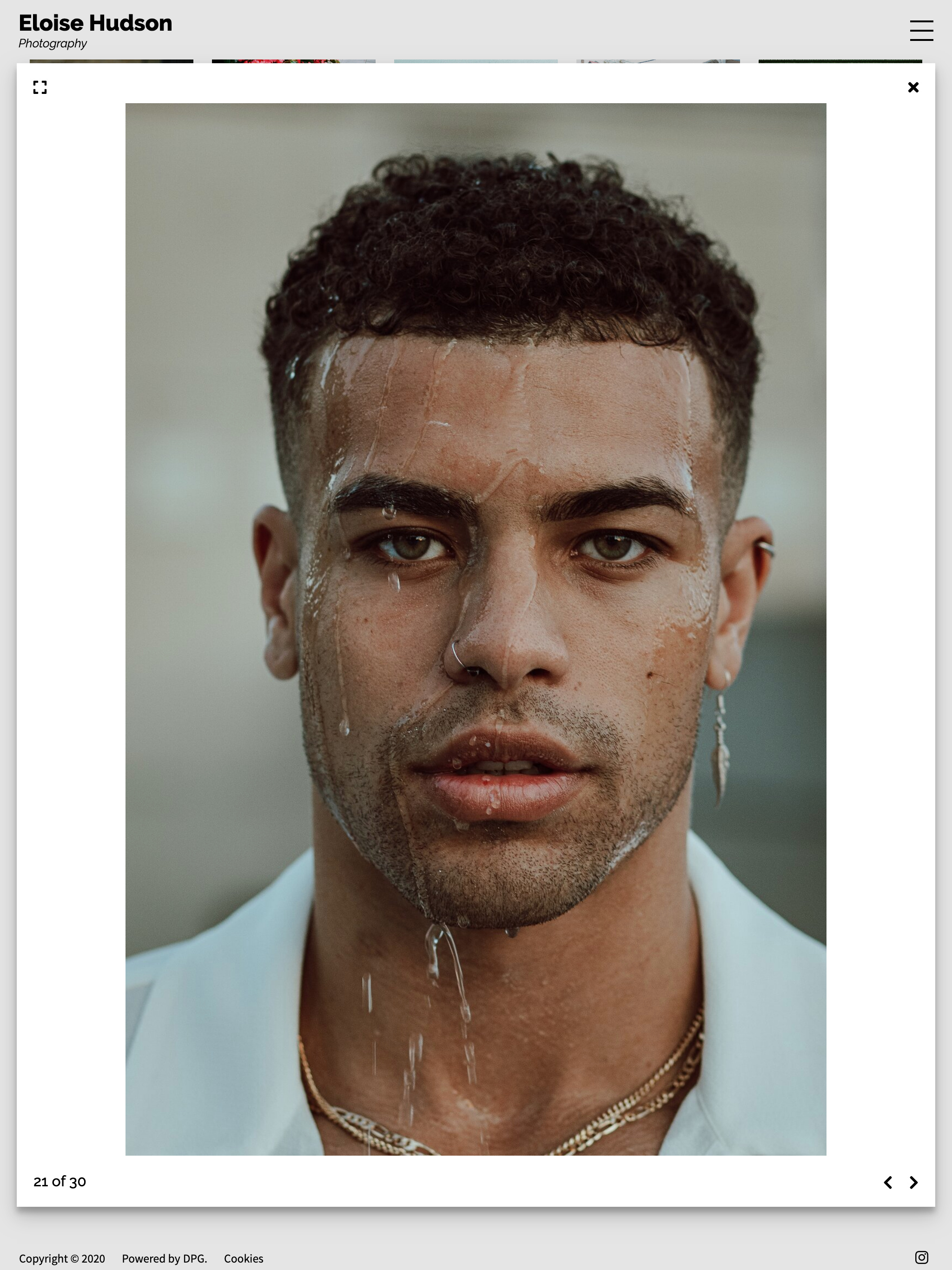
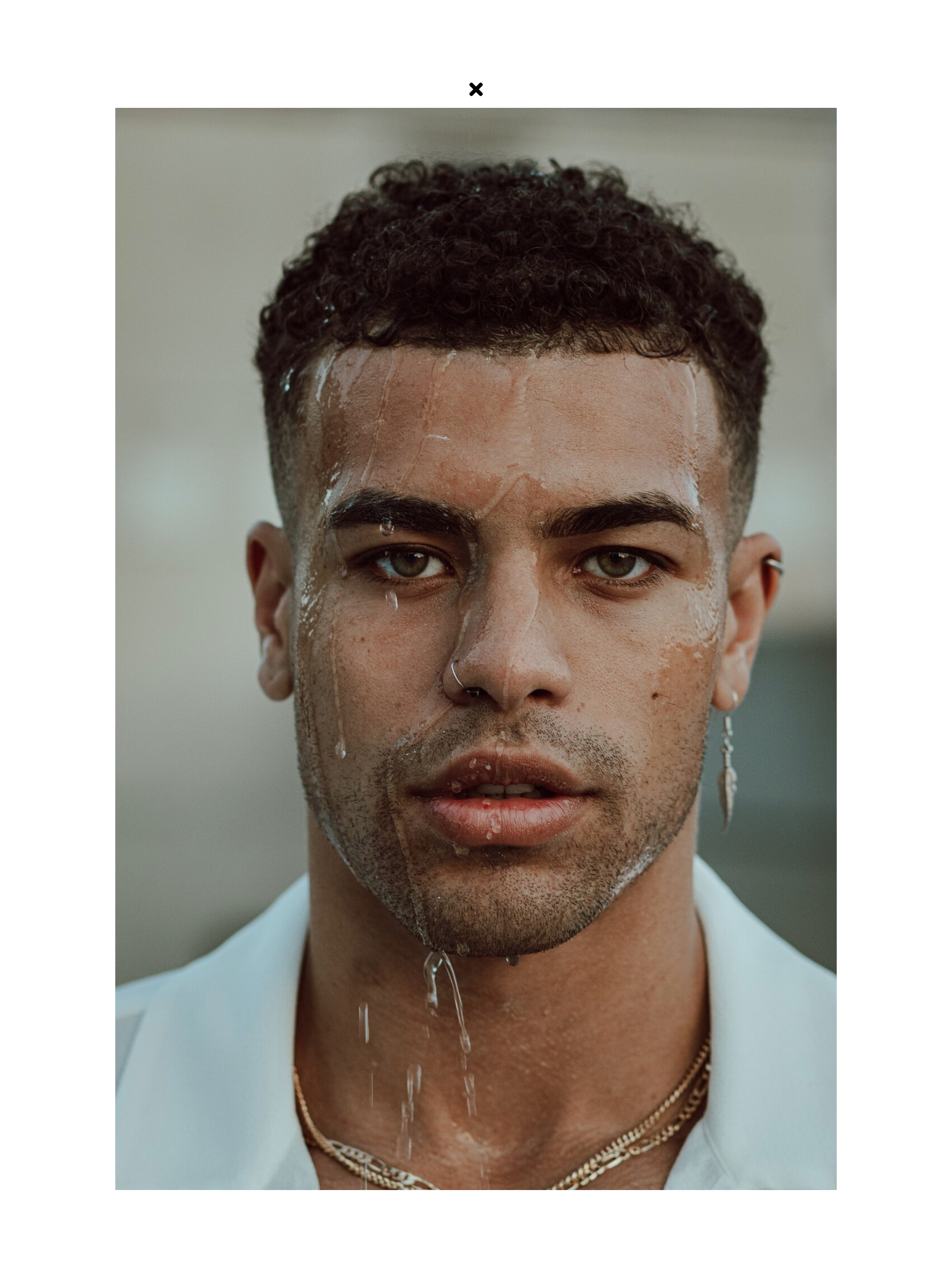
🎨 Customise it - choose a lightbox background in a contrasting colour to the main site (such as black for a predominantly light theme and vice versa) to give the single view a different context.